Introduction
PCO – a refractory materials manufacturer with over 100 years of history in the heavy industry, selected Poligate as a partner for a comprehensive rebranding of their company.
The company was looking to shift their reputation towards the position of a global leader in the industry, with large-scale manufacturing capabilities and a wide offer of services.
Our team partnered with Sellwise, sales and marketing consultancy, to develop an extensive brand. Built on a solid strategic foundation developed by Sellwise, the project consisted of a sales and marketing strategy, an in-depth revision of their old visual identity, and implementation of the new brand across a plethora of touchpoints – including a website, printed and digital collateral.
Scope
Strategy – SellWise
Visual Identity – Poligate
Web Design – Poligate + Lunarsoft
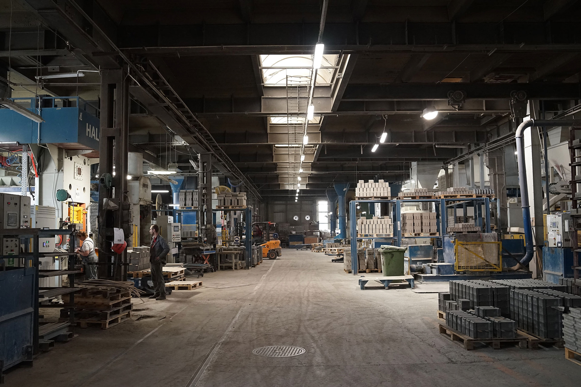
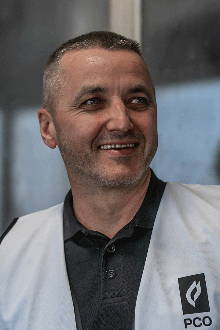
Photoshoot – Poligate + Kamil Blicharski
(Q1)
Brand Implementation – Poligate

The Client
PCO is a global manufacturer of a wide range of refractory materials. The company produces in-house multiple types of solid and powdered products, offers comprehensive support for their clients with regard to product selection and implementation, as well as a technical support teams delegated to their clients.
PCO has over 100 years of history. The company is deeply embedded in the local economy, being a large employer (200+ staff) and having funded multiple local initiatives.


The Challenge
During multiple workshop sessions, the following issues with the old brand were identified:
– An outdated identity, misrepresenting the company as an unprofessional, small-scale business with no presence in the market
– Communication gaps in the sales process, current and new clients not being aware of important elements within the offer
– Mediocre brand disappearing among competitors
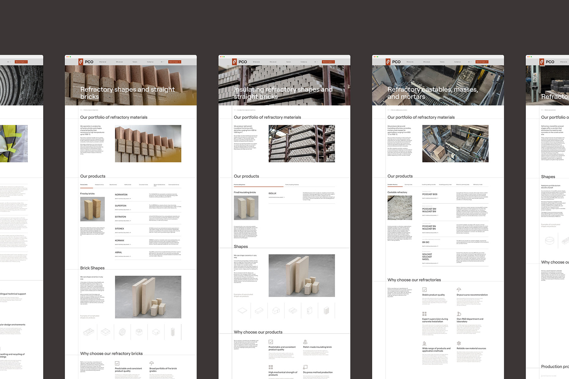
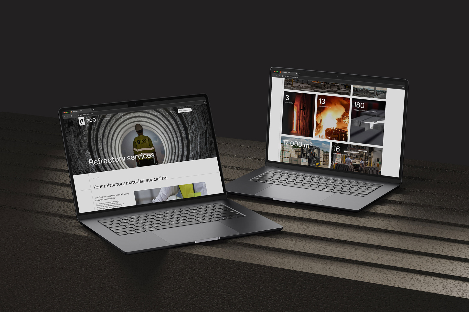
– Lack of online presence – website not constructed up current digital standards, poor UX and search engine performance
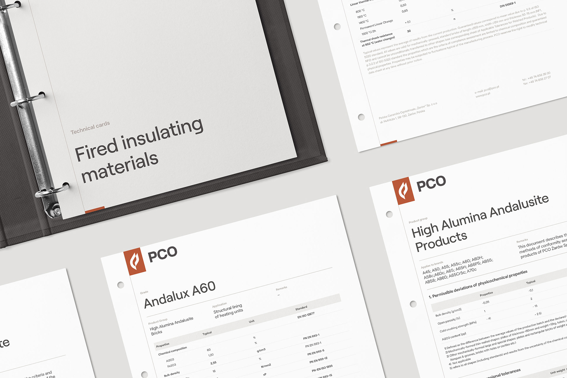
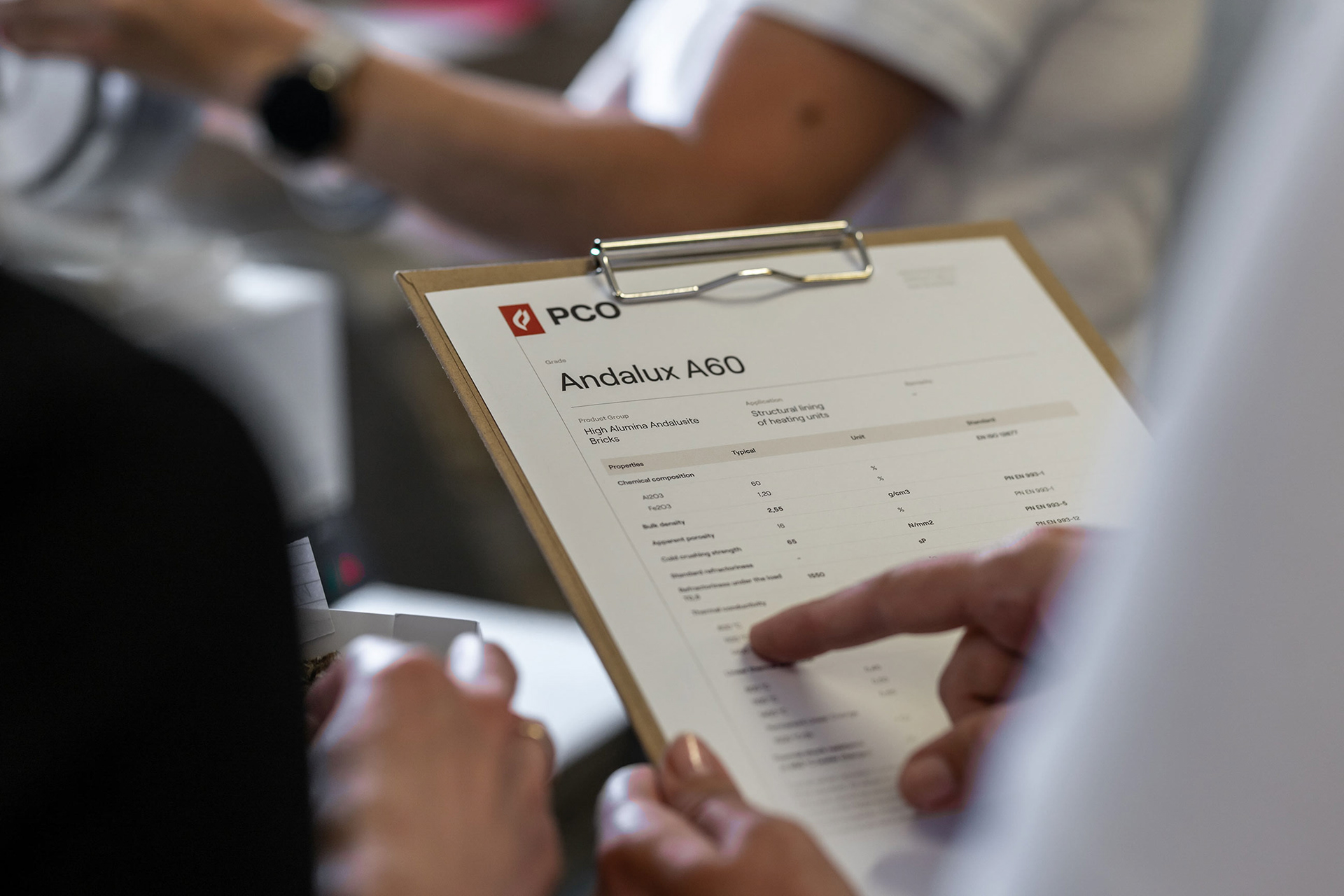
– Technical documentation lacking consistency, clients can’t access them online, need for an accessible documentation hub


Approach
Strategy developed by Sellwise identified PCO’s brand archetype as the Caregiver – due to the tremendous importance of the support and technical acumen required to select, ship and implement the products. PCO forms long-term relationships with their clients, and is a very important local employer. The brand had to facilitate both aspects of their identity, radiate approachable professionalism, and promote an image of a modern business with technical excellence with global operational capabilities.
Services provided by Sellwise:
– Mission, vision and values formulation
– Brand strategy development
– Buyer personas definition
– Sales strategy
– Marketing strategy
– Communication strategy


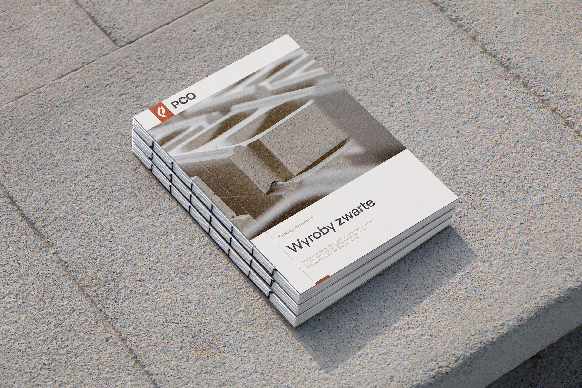
Solutions
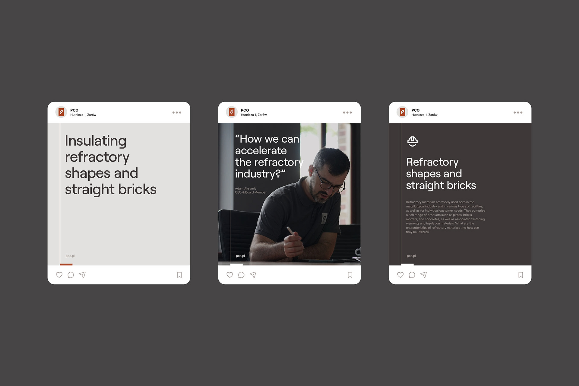
During a series of workshops our team started with developing a visual identity that encompasses the approachable professionalism nature of the brand. We proposed a content structure aligned with the communication strategy and designed a user-friendly website as well applied the identity to a multitude of both digital and physical touchpoints. Our team supported with the implementation of the brand and conducted an extensive photoshoot for current and future use.

Visual Identity
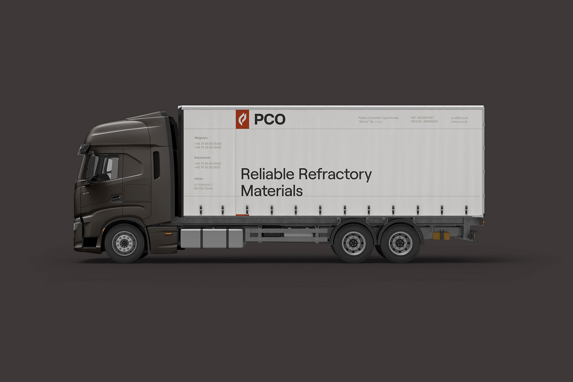
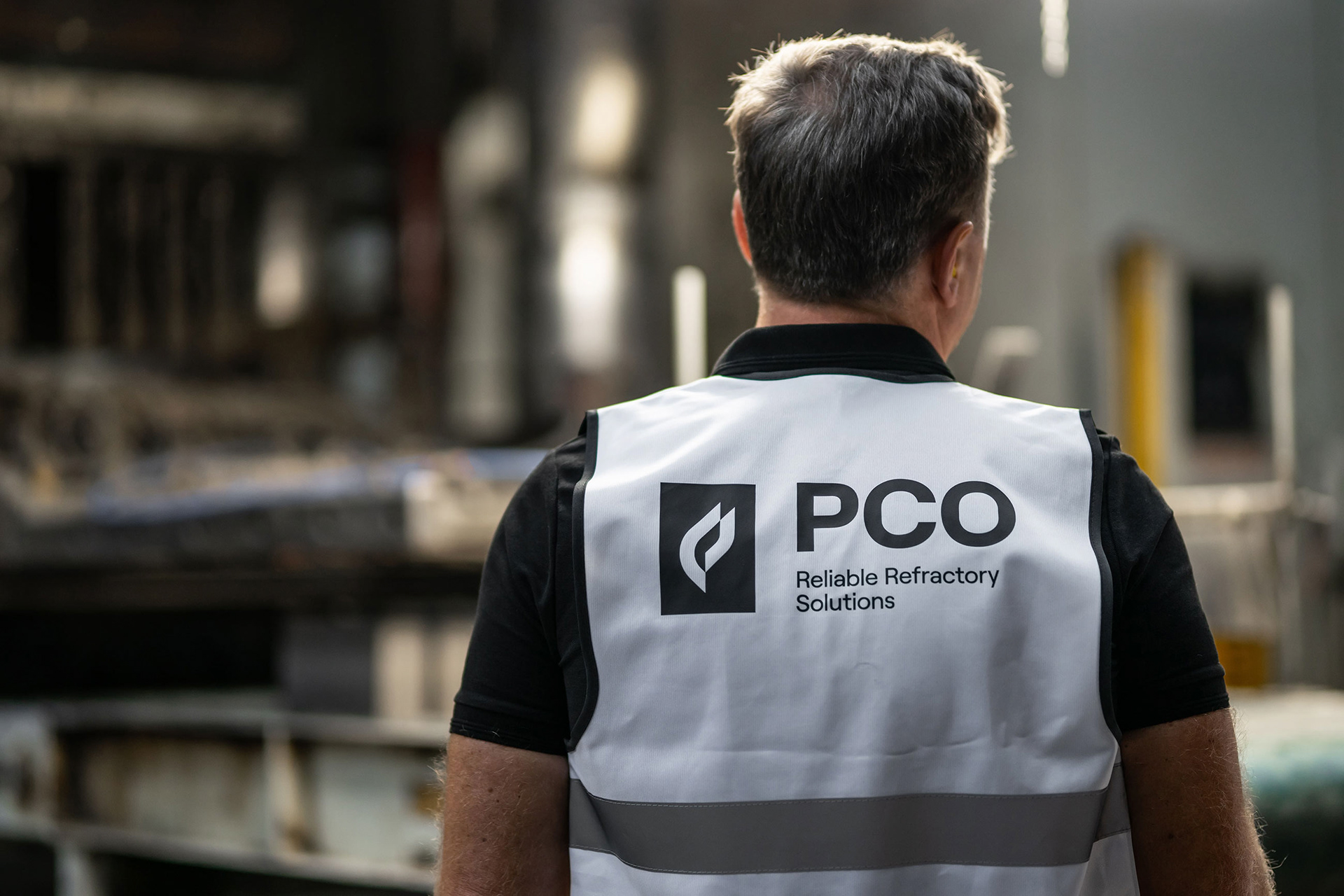
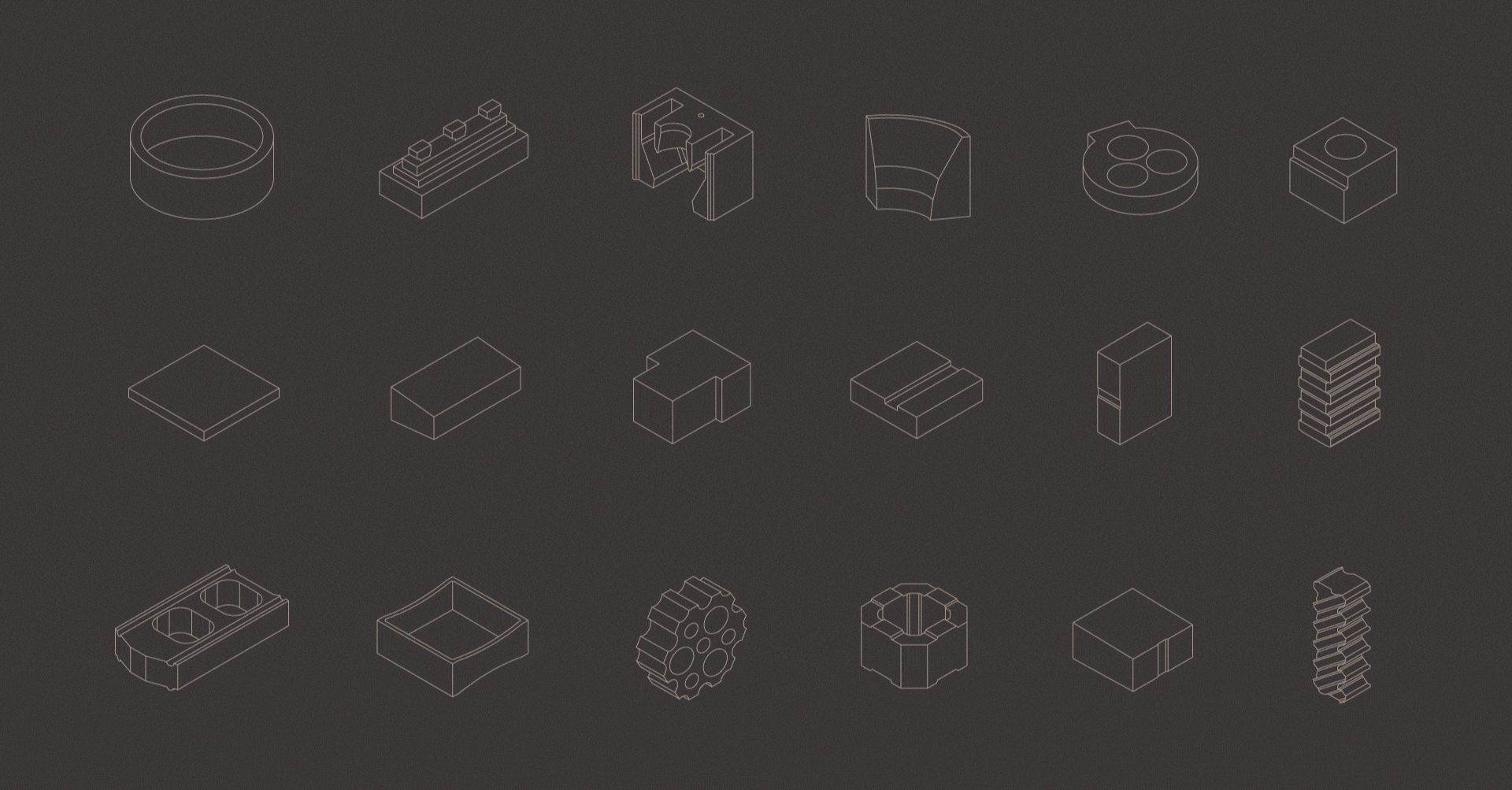
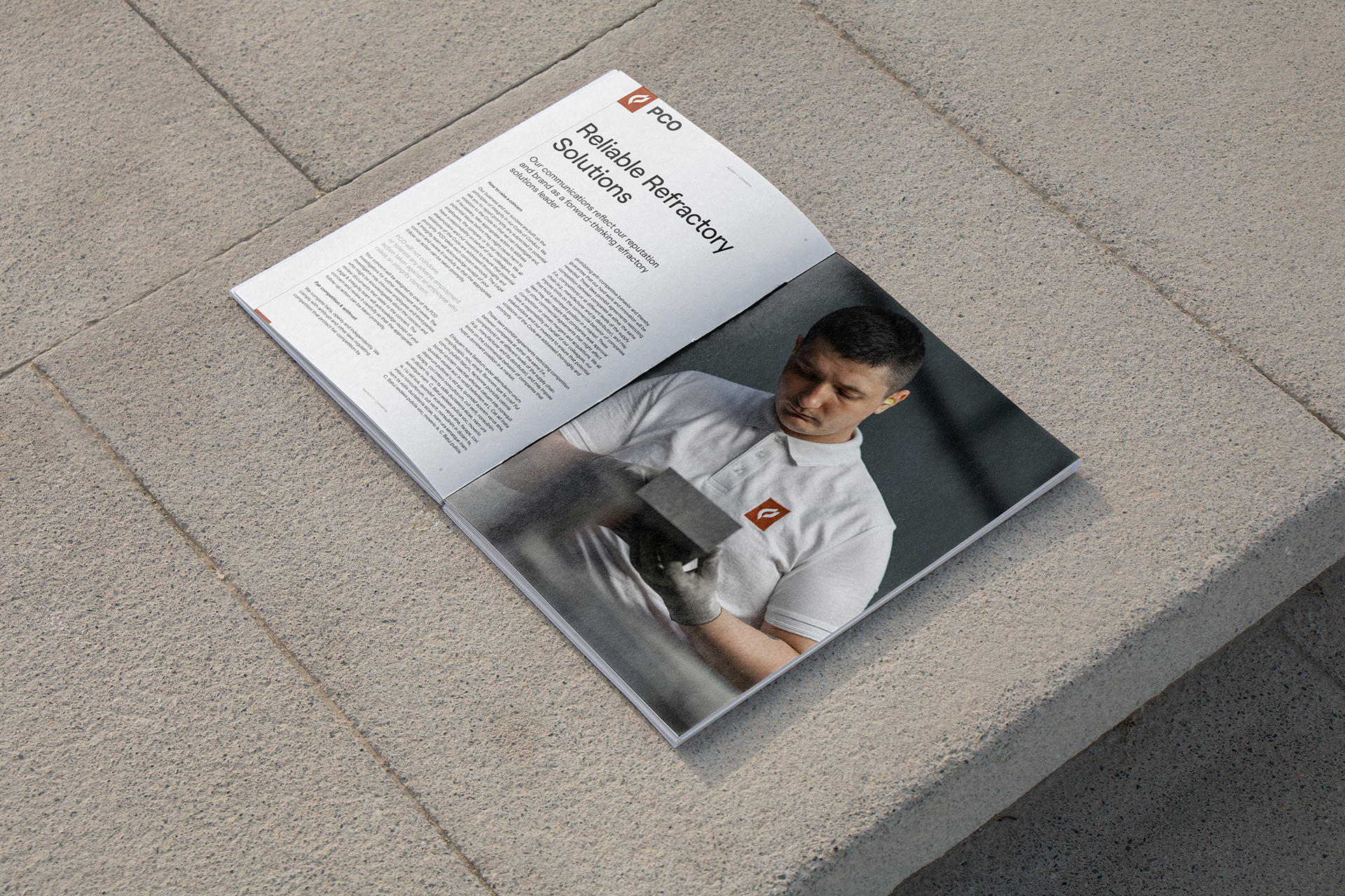
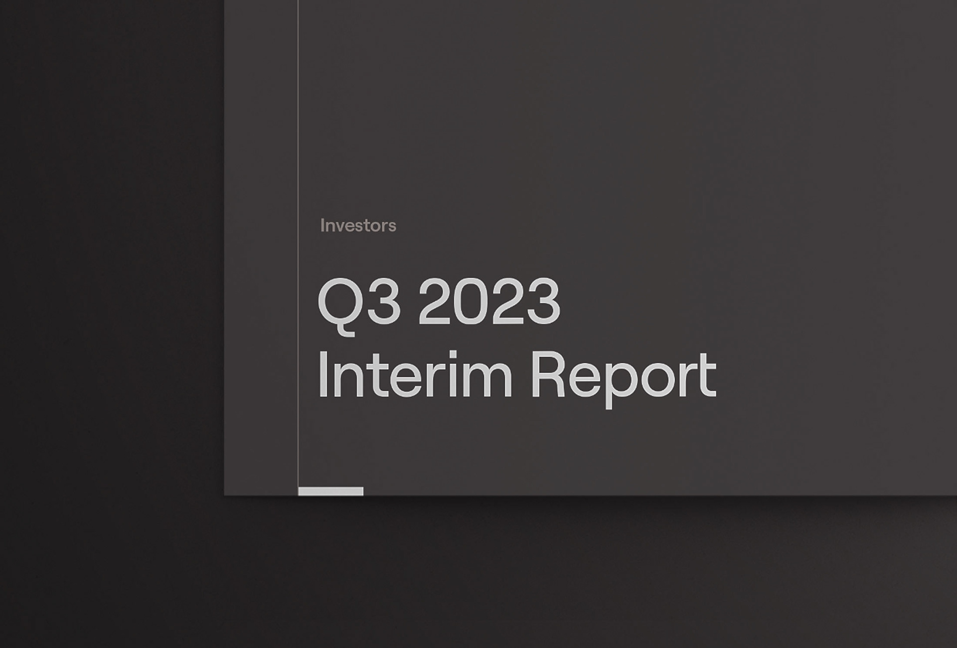
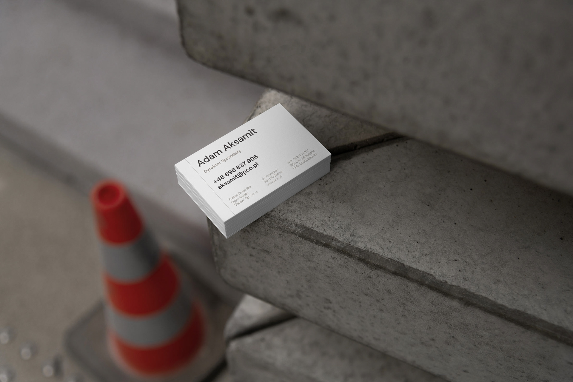
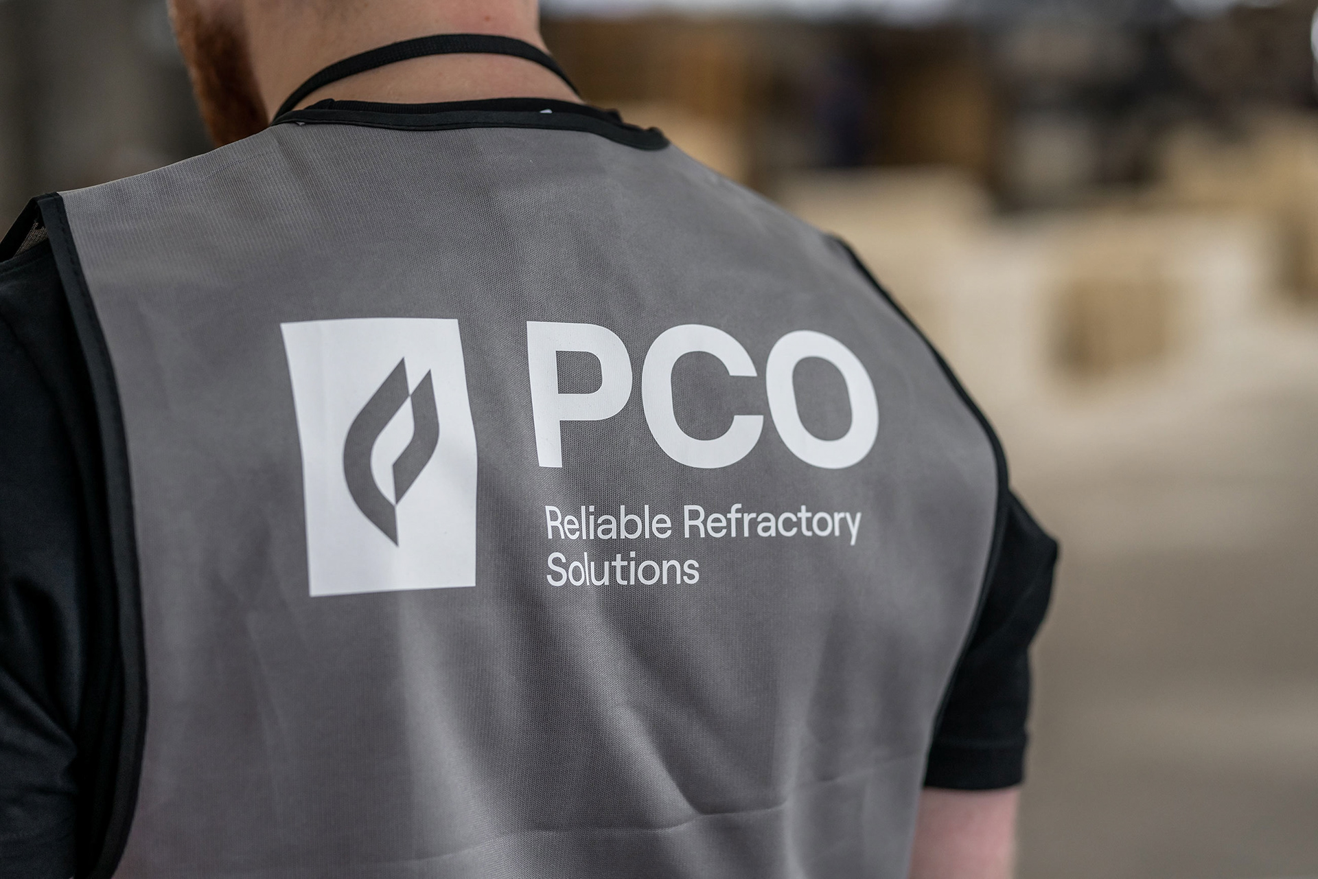
The identity is a face of the brand – often responsible for the first impression and an initial contact with the company. The identity of PCO utilizes a professional and reserved look, implying the highly technical nature of the industry, with a human touch expressed in photography and soft, rounded lines of the typeface and iconography.
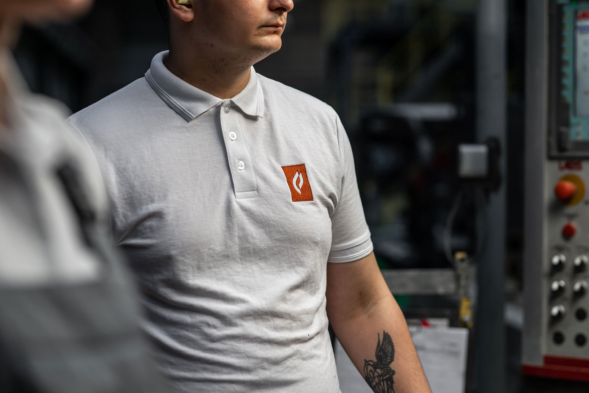
– Earthly tones of the color palette are directly related with their product, perfectly matching the shades of various types of solid and powder materials.
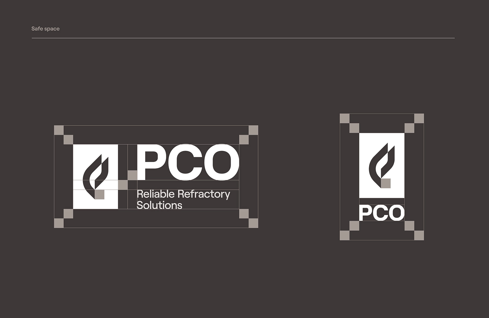
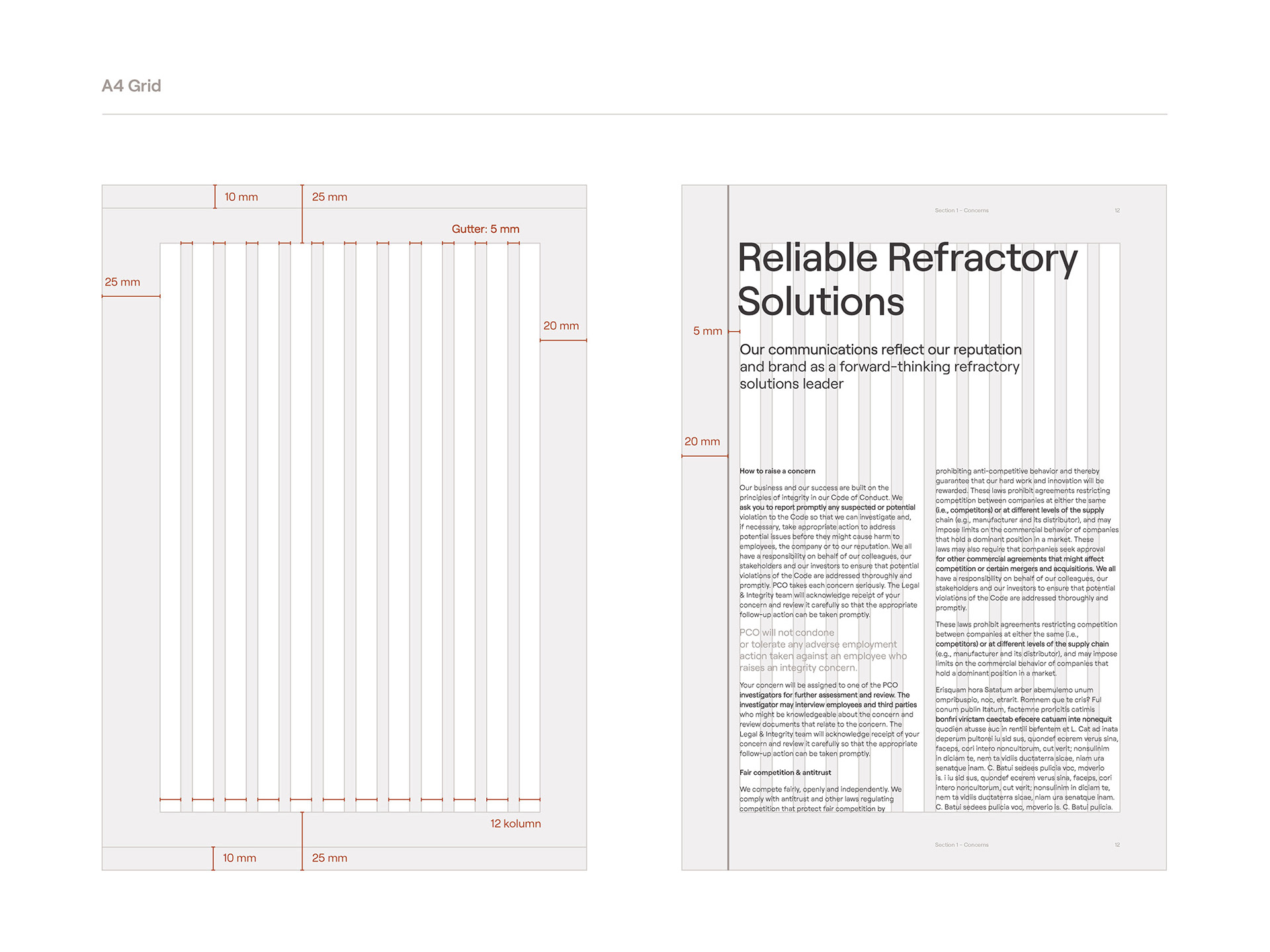
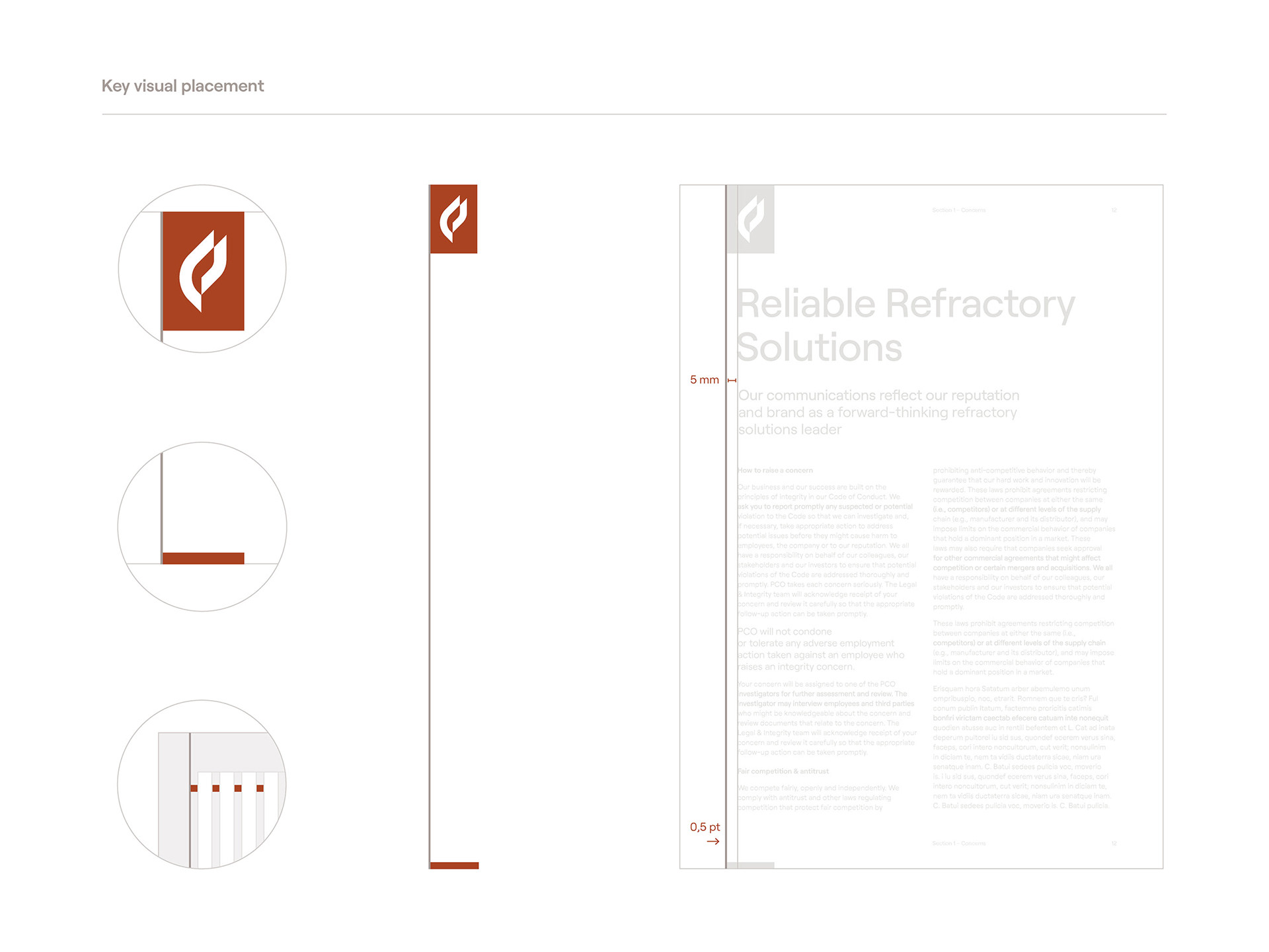
– The system introduces a set of horizontal and vertical rulers that help with organizing information, especially in highly technical use cases.
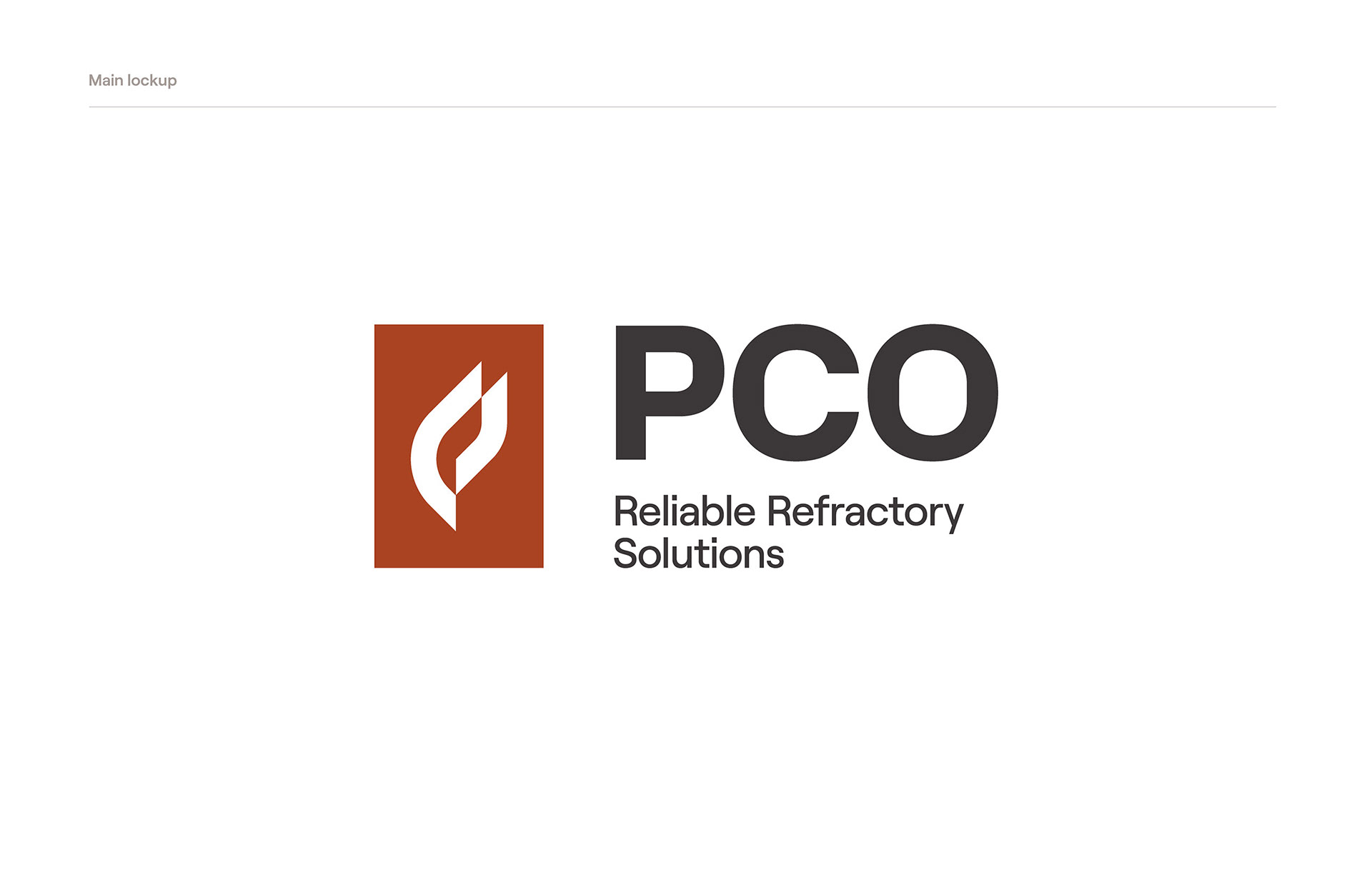
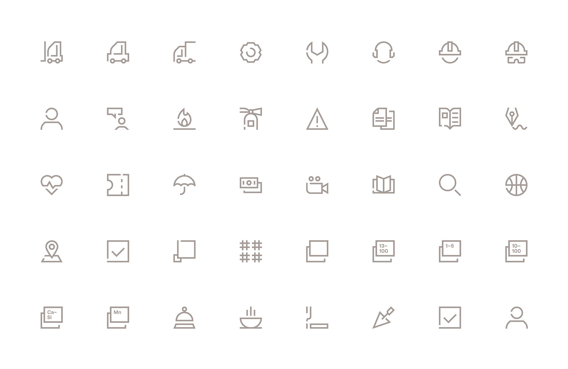
– Typography plays a major role – a contemporary sans serif Roobert by the Display Foundry is a nod both to the technical nature of the brand with it’s strong horizontal and vertical terminals, and to the human side thanks to the rounded corners.
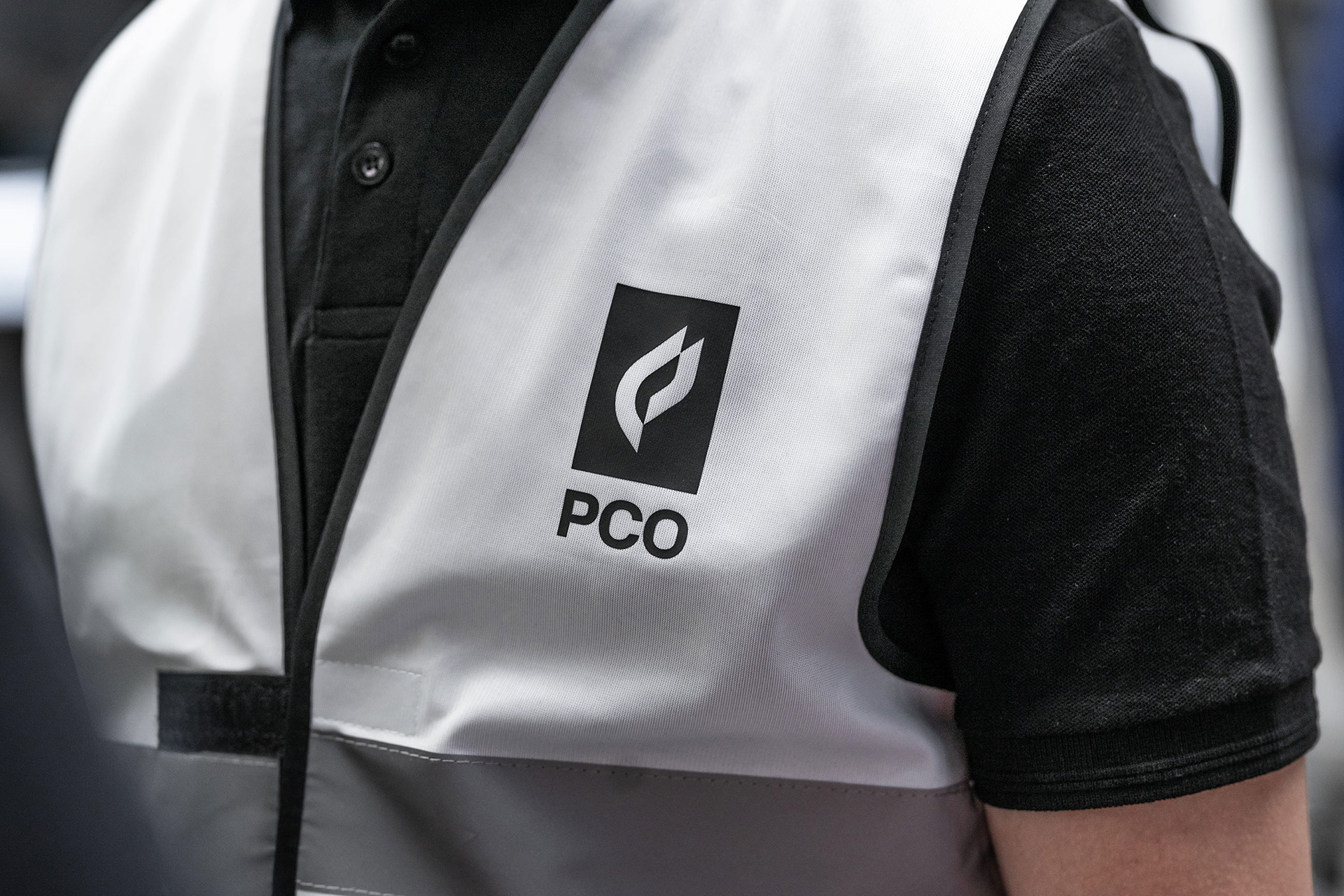
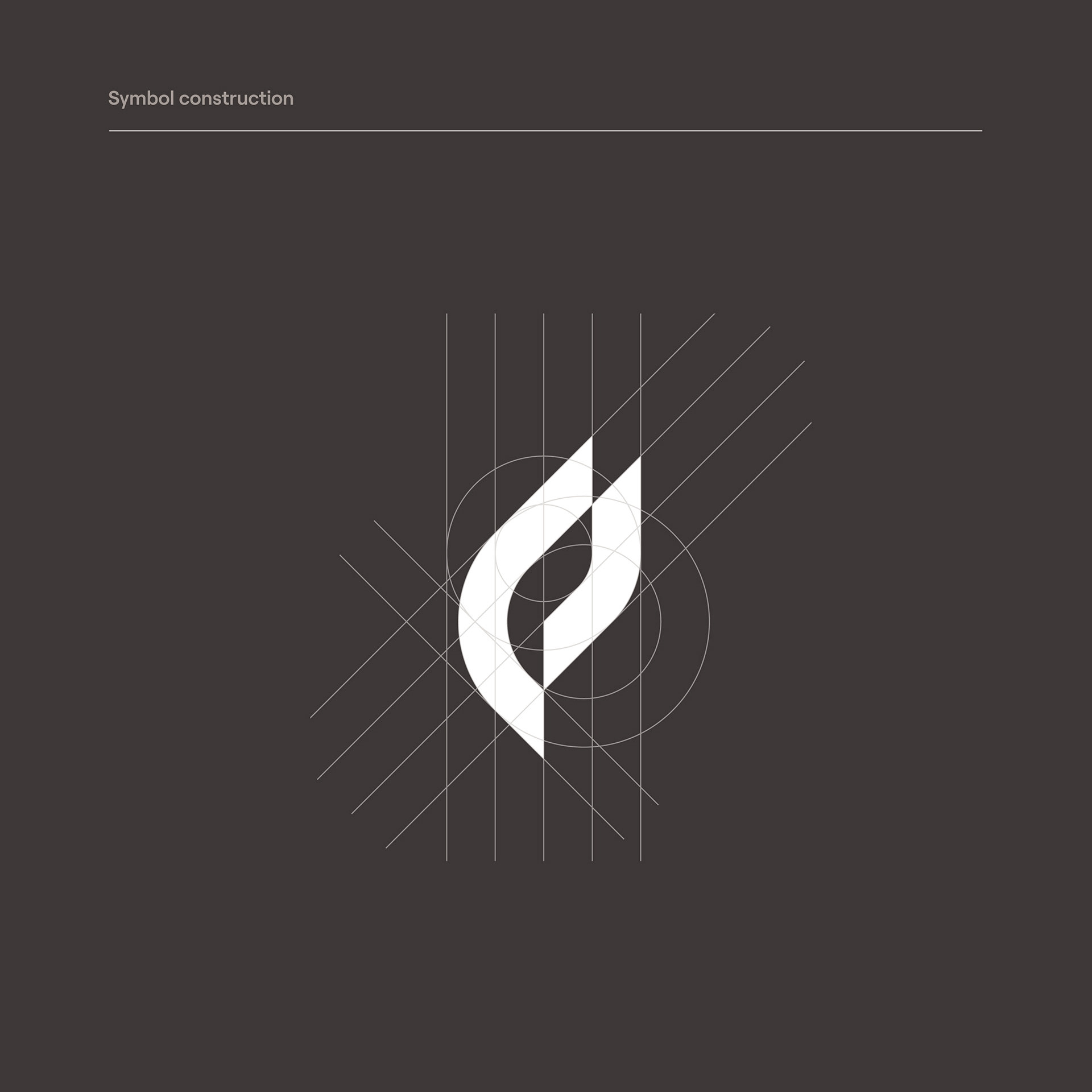
– The logo is a modern and simplified reinterpretation of the old mark. The original DNA of the brand was preserved in the use of a fire symbol – a more sophisticated geometry was introduced in order to make the mark stand out from a commonly spotted icon of a flame. By placing the mark inside a rectangle, it gains a modular nature, allowing it to freely move up and down the rulers and edges of a layout.


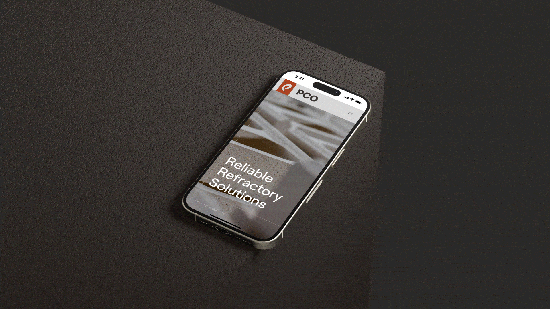
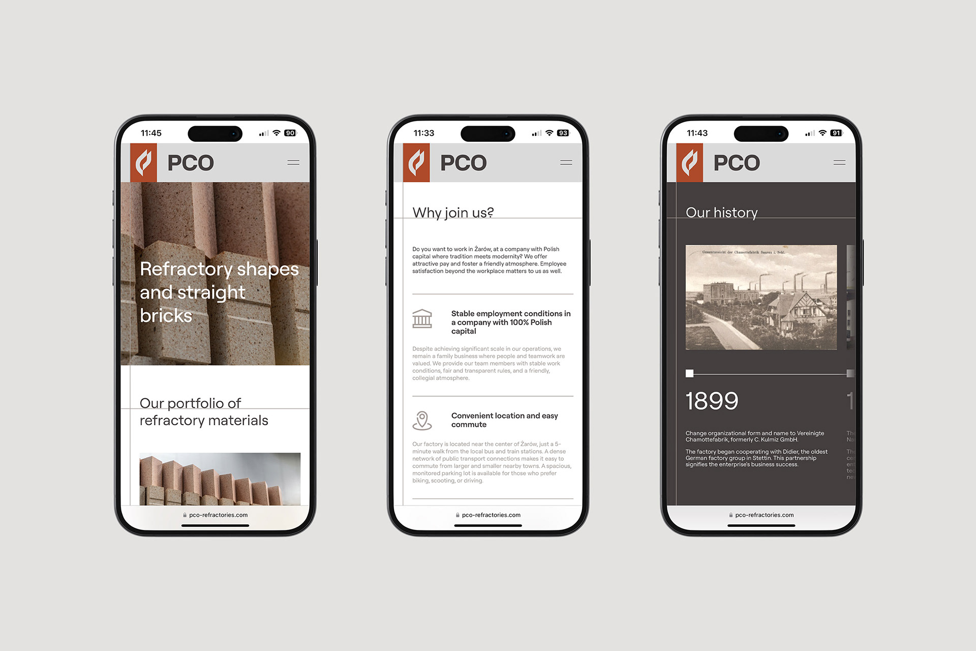
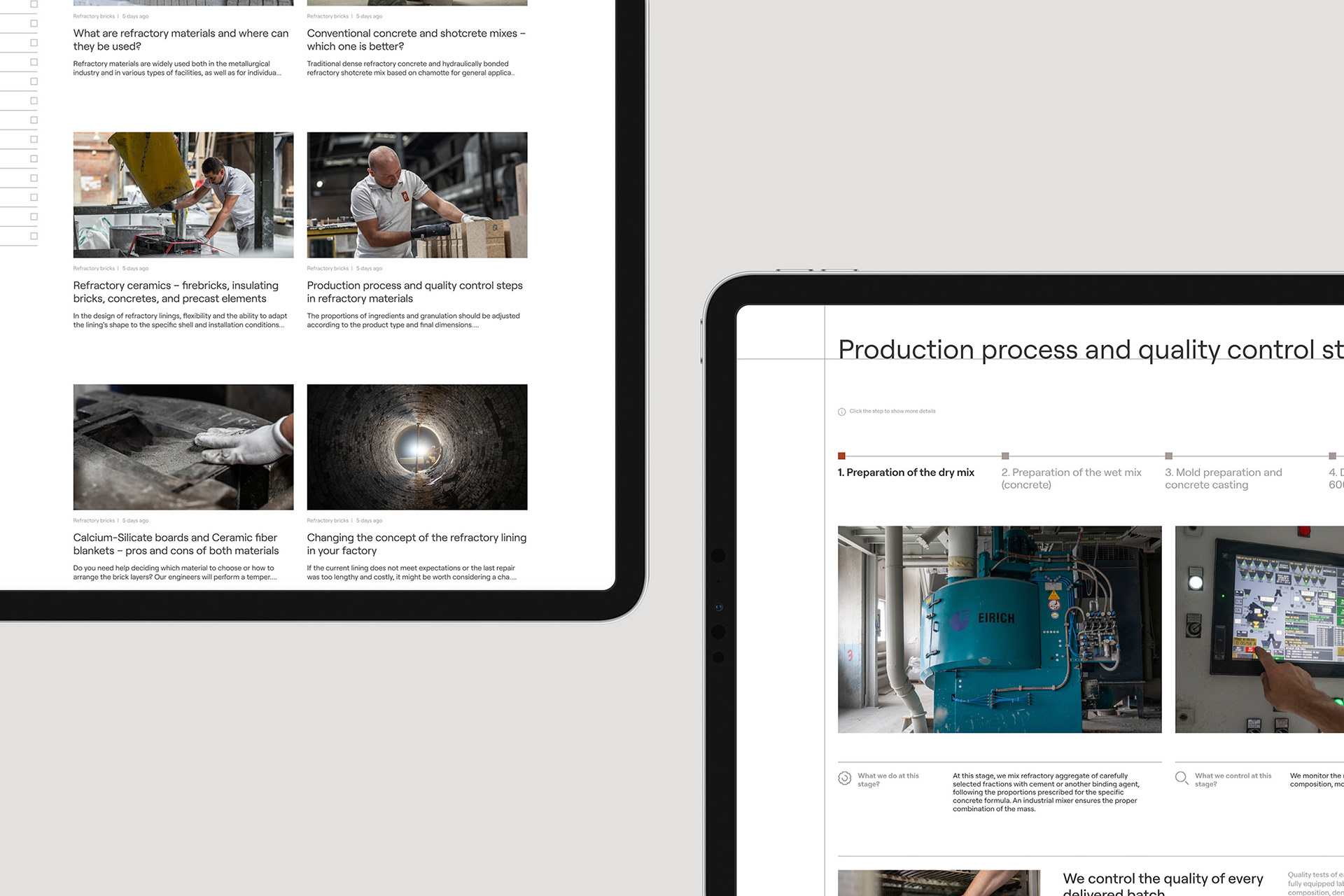
Web Design
The identity is a face of the brand – often responsible for the first impression and an initial contact with the company. The identity of PCO utilizes a professional and reserved look, implying the highly technical nature of the industry, with a human touch expressed in photography and soft, rounded lines of the typeface and iconography.

Brand Implementation
The identity is a face of the brand – often responsible for the first impression and an initial contact with the company. The identity of PCO utilizes a professional and reserved look, implying the highly technical nature of the industry, with a human touch expressed in photography and soft, rounded lines of the typeface and iconography.