Scope + Team
Strategy – SellWise
Visual Identity – Poligate
Web Design – Poligate + Lunarsoft
Photoshoot – Poligate + Kamil Blicharski
(Q1)
Brand Implementation – Poligate
The Client
PCO is a global manufacturer of various refractory materials, producing both solid and powdered products in-house. They offer comprehensive client support, including product selection, implementation, and technical assistance. As a key player in the local economy, the company employs over 200 staff and funds multiple community initiatives.
The Challenge
01.
Business scale and ambitions are underrepresented in the brand across all touchpoints.
03.
Imprecise sales process, leaving current and new clients unaware of PCO's capabilities.
02.
Need to stand out among competitors with a strong and modern visual identity.
04.
Lack of online presence – website not up to current digital standards.

Approach
PCO fosters long-term client relationships and is a key local employer. The brand had to reflect both aspects, radiate approachable professionalism, and promote a modern, technically excellent global business. During strategy sessions, the team focused on optimizing sales processes and establishing a clear vision for the communication and visual identity.
Services provided by SellWise:
01. Mission, vision and values formulation
02. Brand strategy development
03. Buyer personas definition
04. Sales and marketing strategy
Solutions
"Cooperation with the client focused on remodeling sales processes and structures and implementing tailored marketing processes and activities. One of the elements of this change was also the visual aspect of the brand. Together with Poligate, we have created a great, complementary team. I was responsible for the brand strategy and its foundations, such as developing the Buyer Persona, value proposition, and marketing strategy.
Poligate and the team were responsible for the design part related to the comprehensive development and implementation of the new visual identification. I was also responsible for strategic supervision of all work results. It was a great collaboration, and the results are spectacular!"
Alicja Ortynecka | SellWise
Executive Sales & Marketing Consultant
Visual Identity
"The challenge in revamping PCO's visual identity was to evoke a modern look while staying rooted in the industrial and highly technical feel of the industry. We implemented Swiss Style layouts and typography, focusing on structuring information rather than creating flashy visuals."
Oskar Drobczyk | Poligate
Brand & Graphic Designer, Co-founder
Brand & Graphic Designer, Co-founder
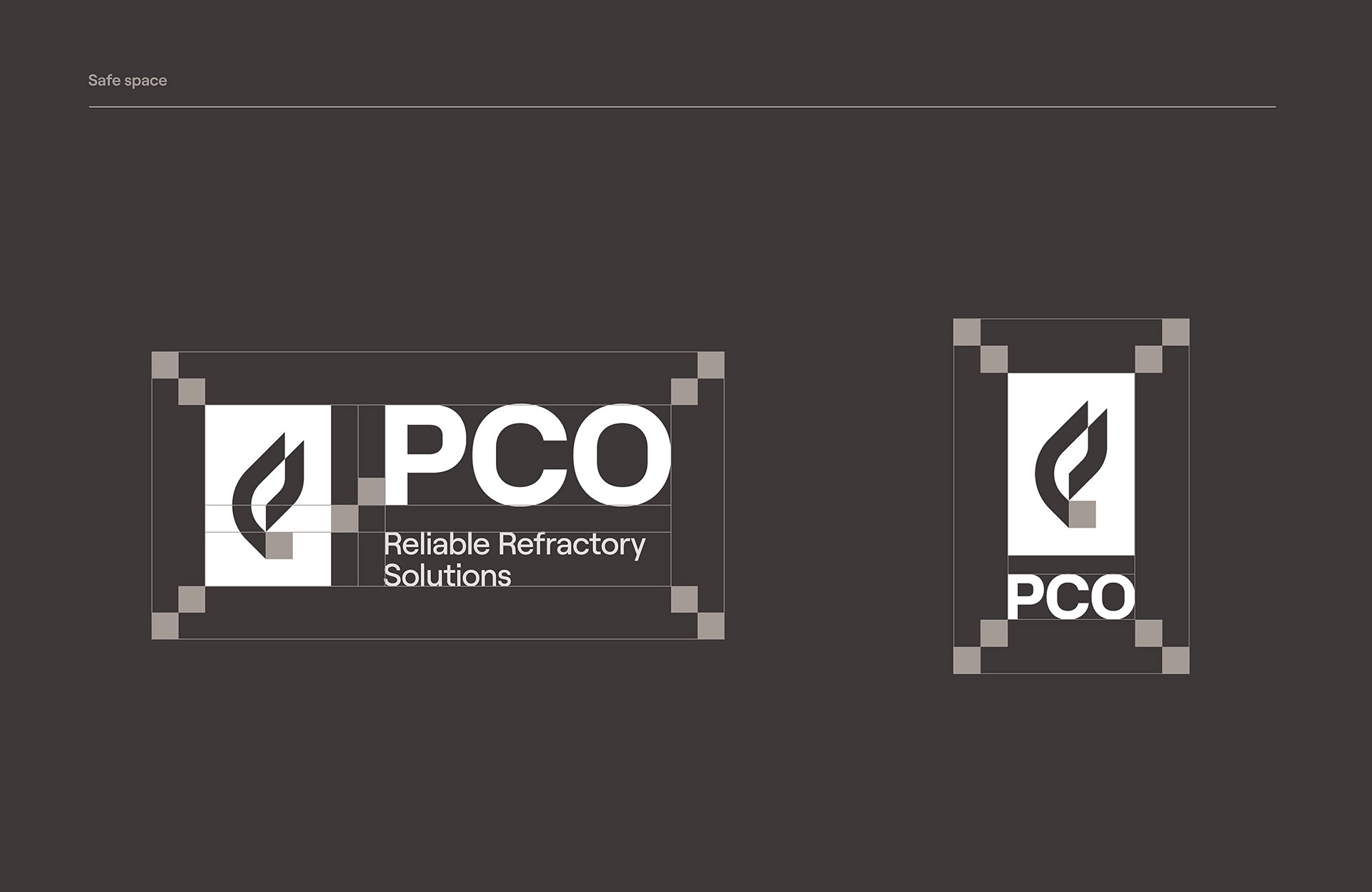
Logo
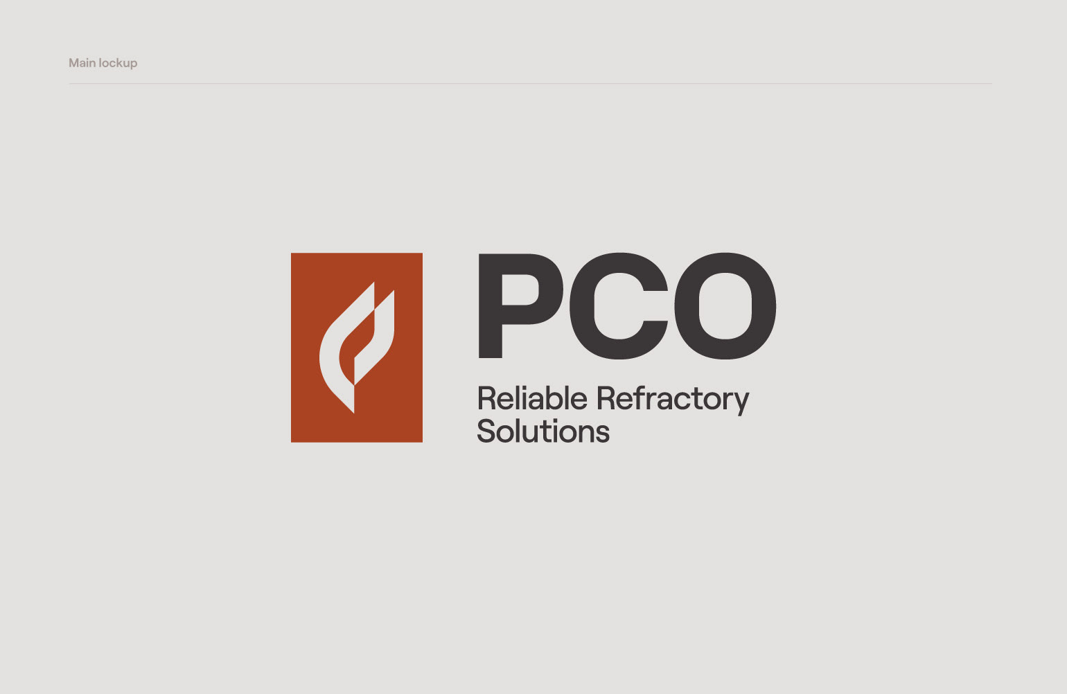
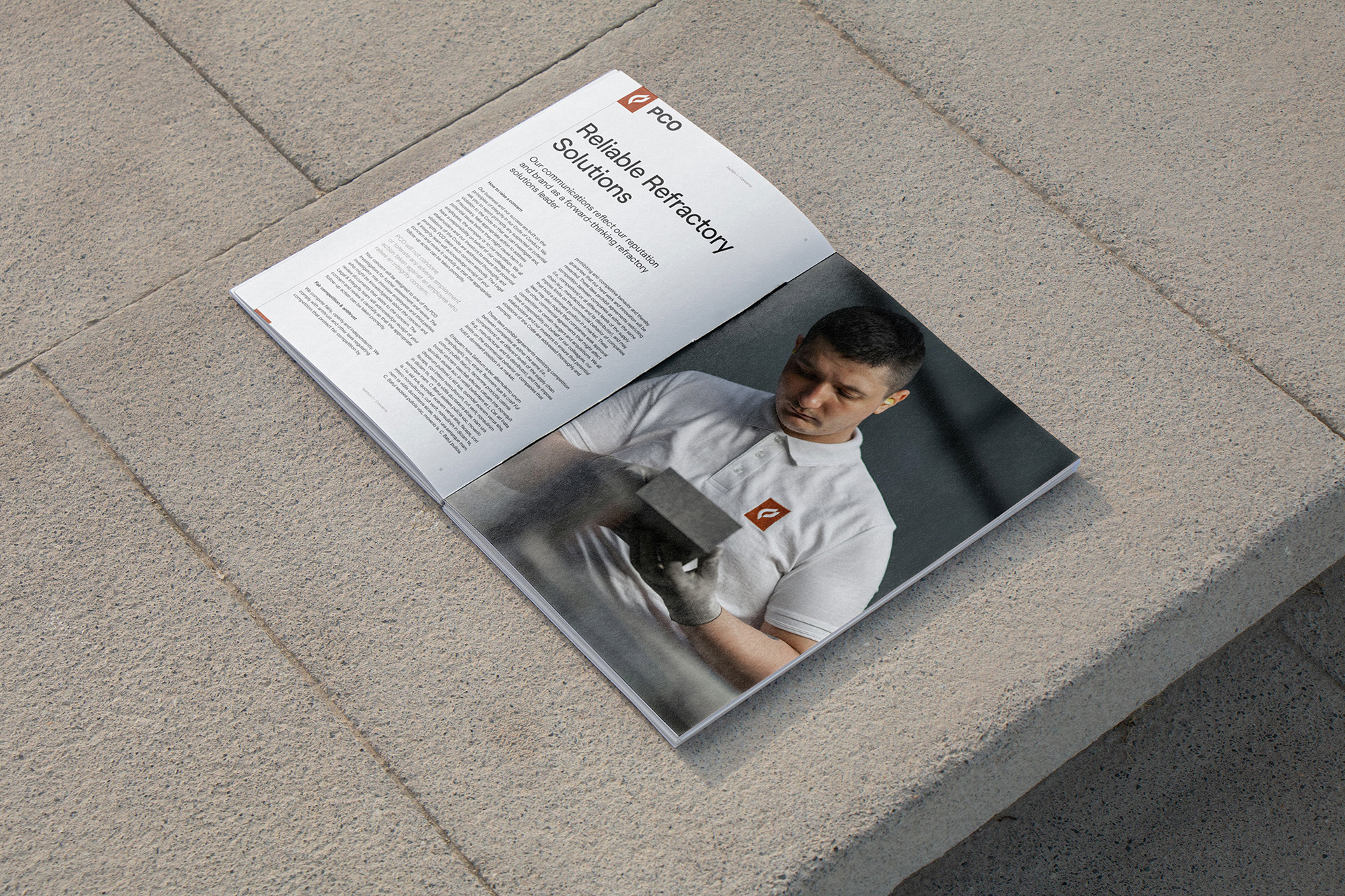
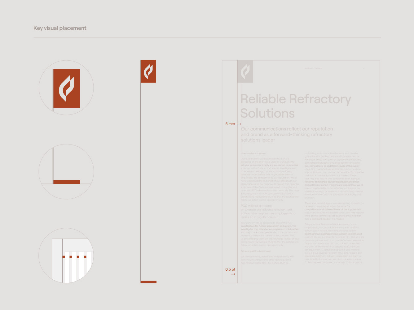
A modern reinterpretation of the original, retains the fire symbol while introducing a more refined geometry. Placing it within a rectangle enhances its versatility in layout design.
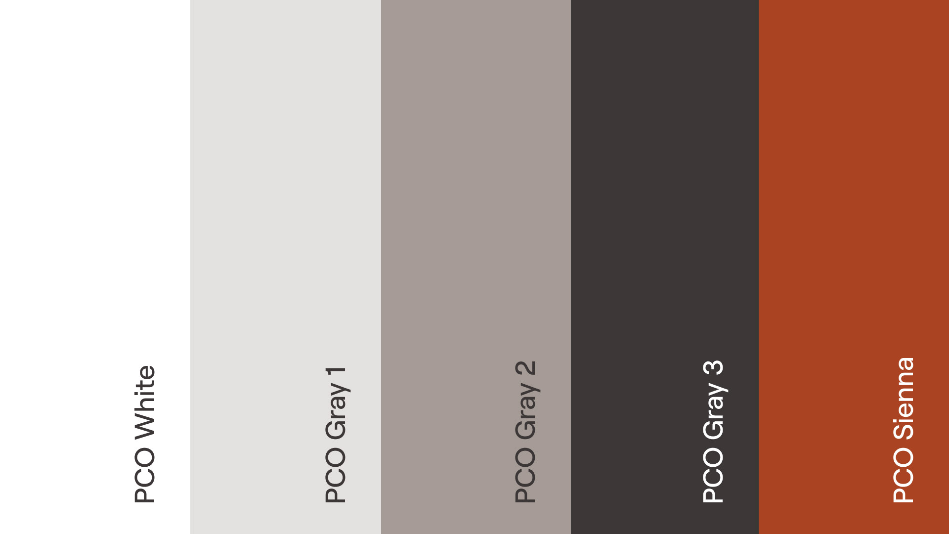
Colors
Earthy tones in the color palette echo the materials used and products manufactured by PCO. The highlight color relates to the fire-forging and heat-treatment of products.


Type
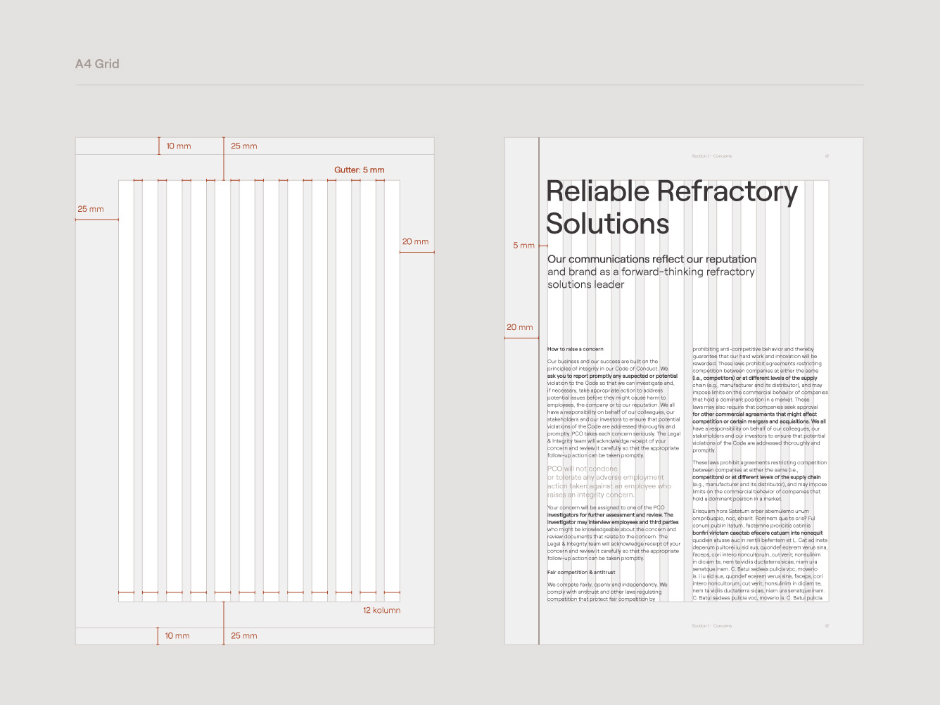
Typography, featuring the contemporary sans serif Roobert by the Display Foundry, balances technical precision with human warmth.
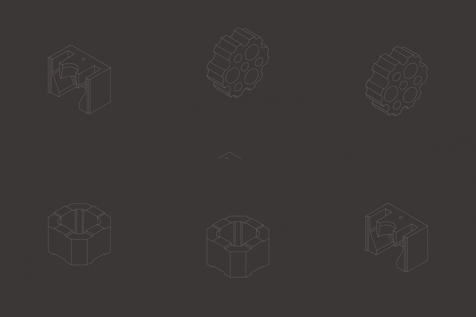
Rulers
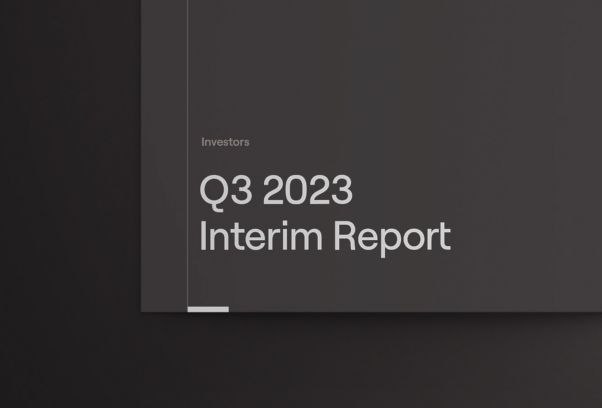
The system includes horizontal and vertical rulers to organize technical information effectively.


Web Development
"The website had to provide a robust set of tools for the client. We focused on implementing a comprehensive CMS for immediate content management and building an online hub for easy access to technical documentation for various stakeholders."
Marcin Lesek | LunarSoft
Software Development Partner
Software Development Partner
Brand Implementation
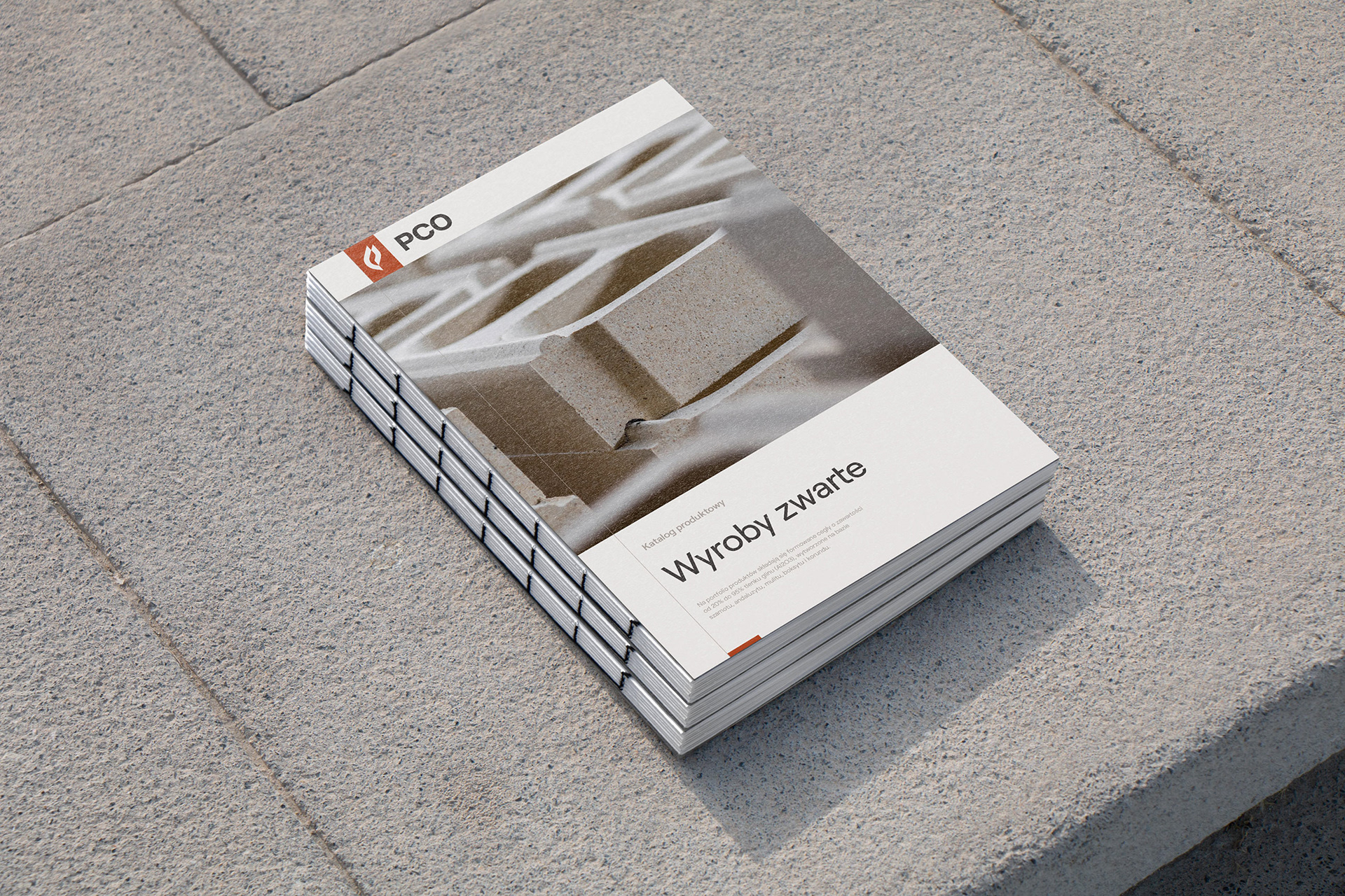
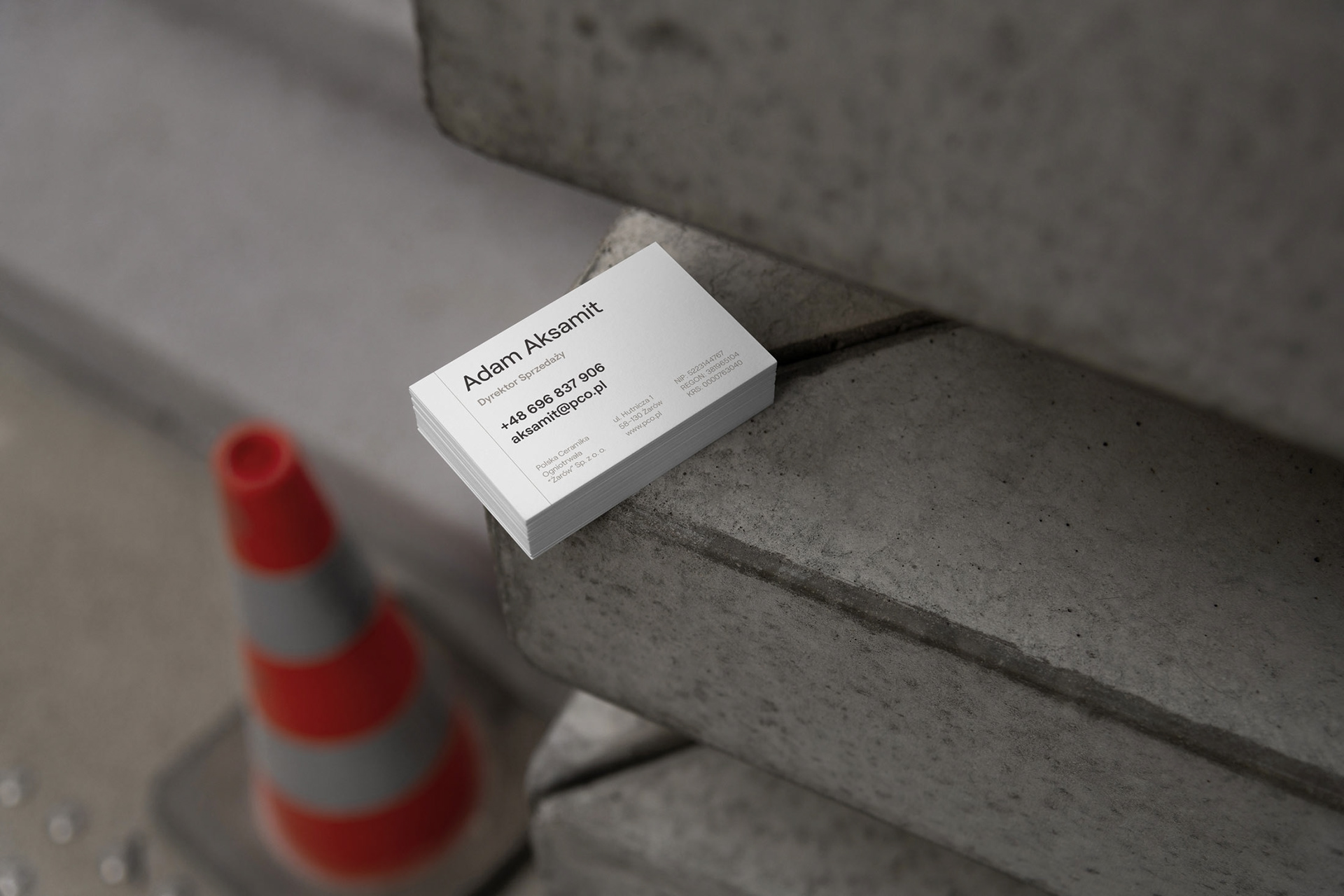
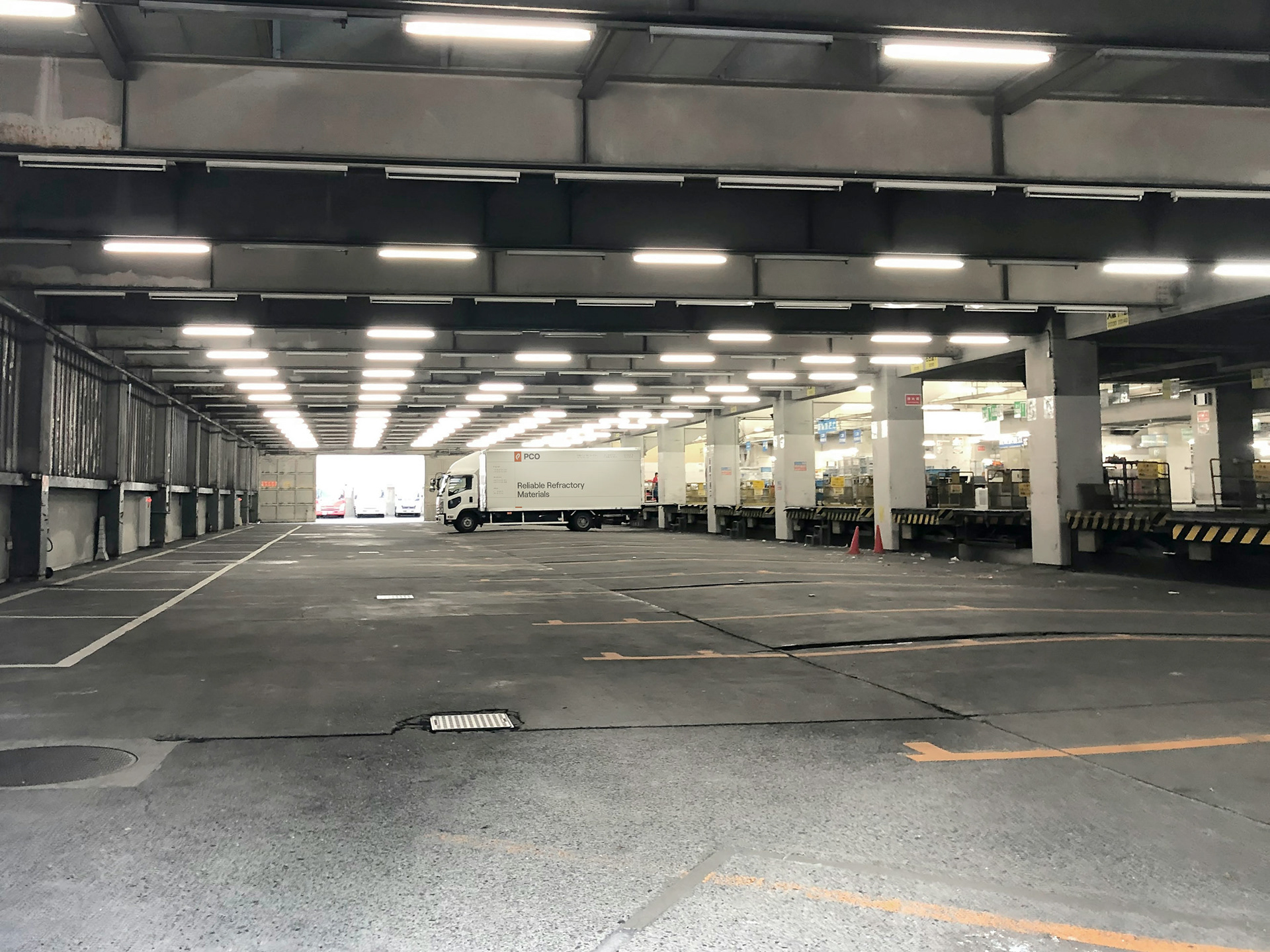
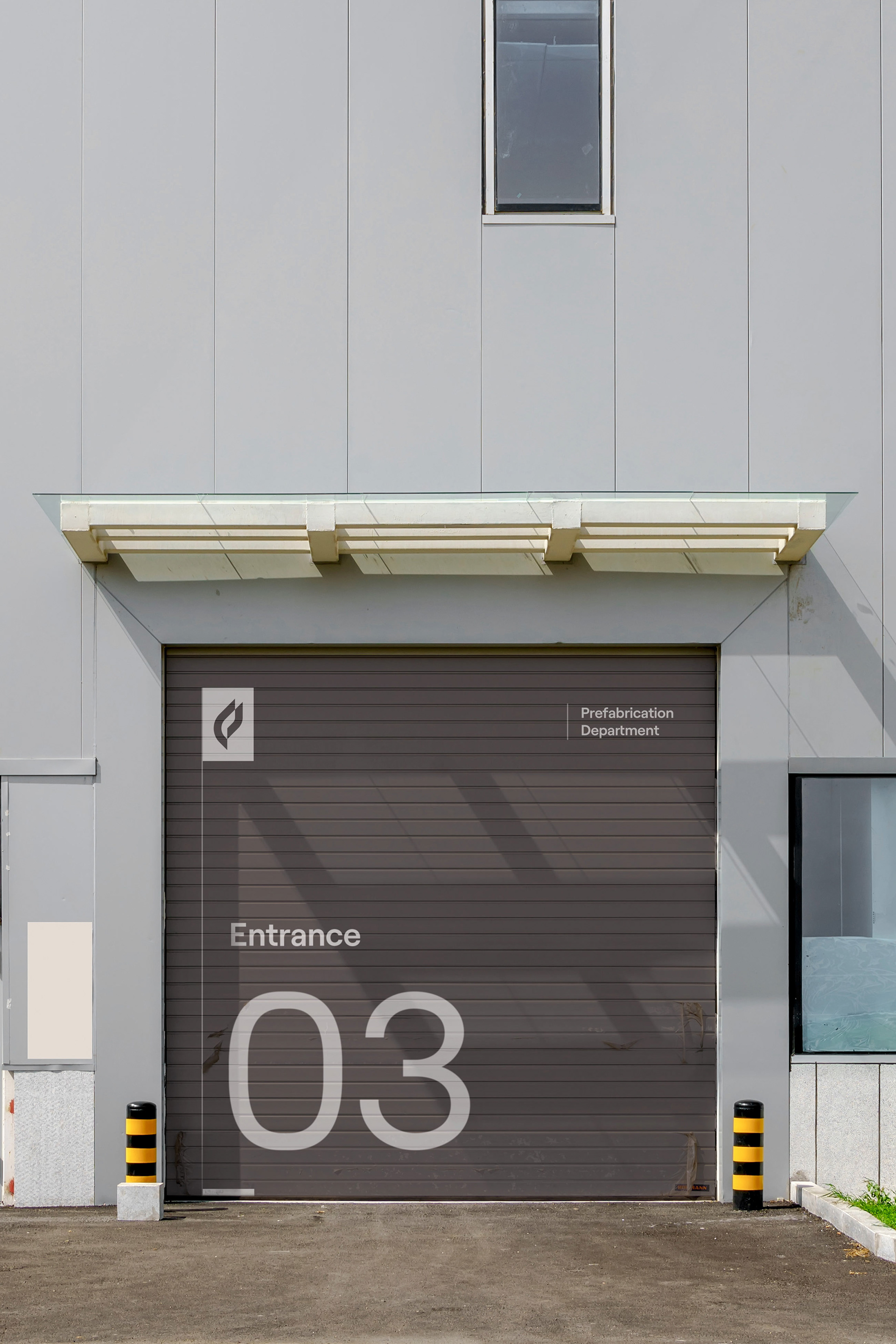
"Our team worked on applying the visual identity across various touchpoints, including printed, digital, and physical assets. We continue to support PCO in the process of brand implementation as it extends into 2024, addressing new challenges such as tradeshows and headquarters renovation."
Krystian Zgoda | Poligate
Brand & Graphic Designer, Co-founder
Brand & Graphic Designer, Co-founder
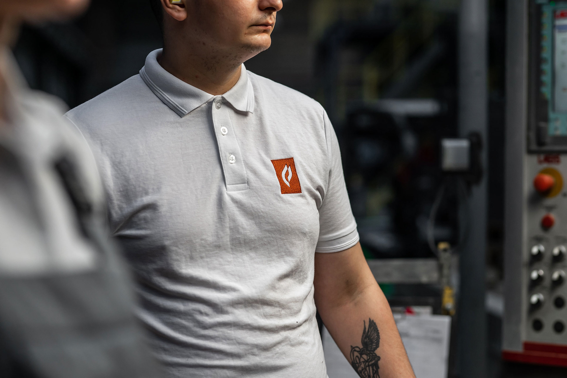
Photoshoot
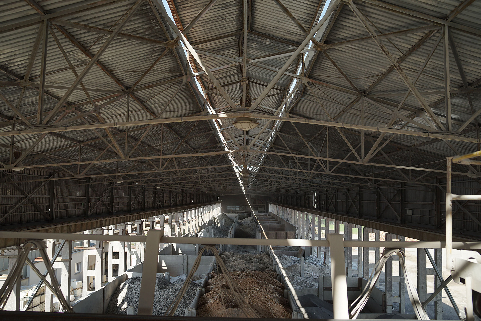
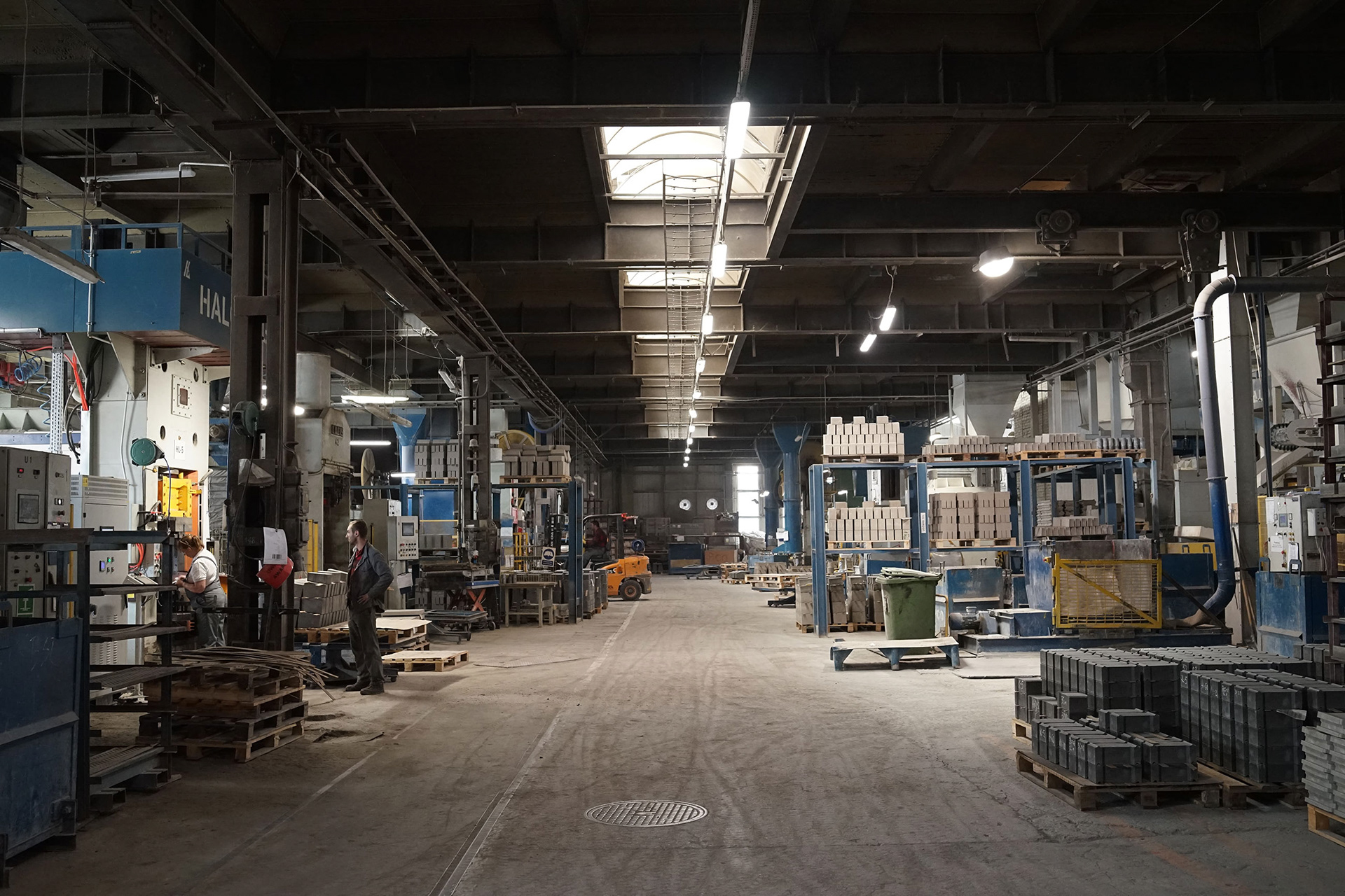
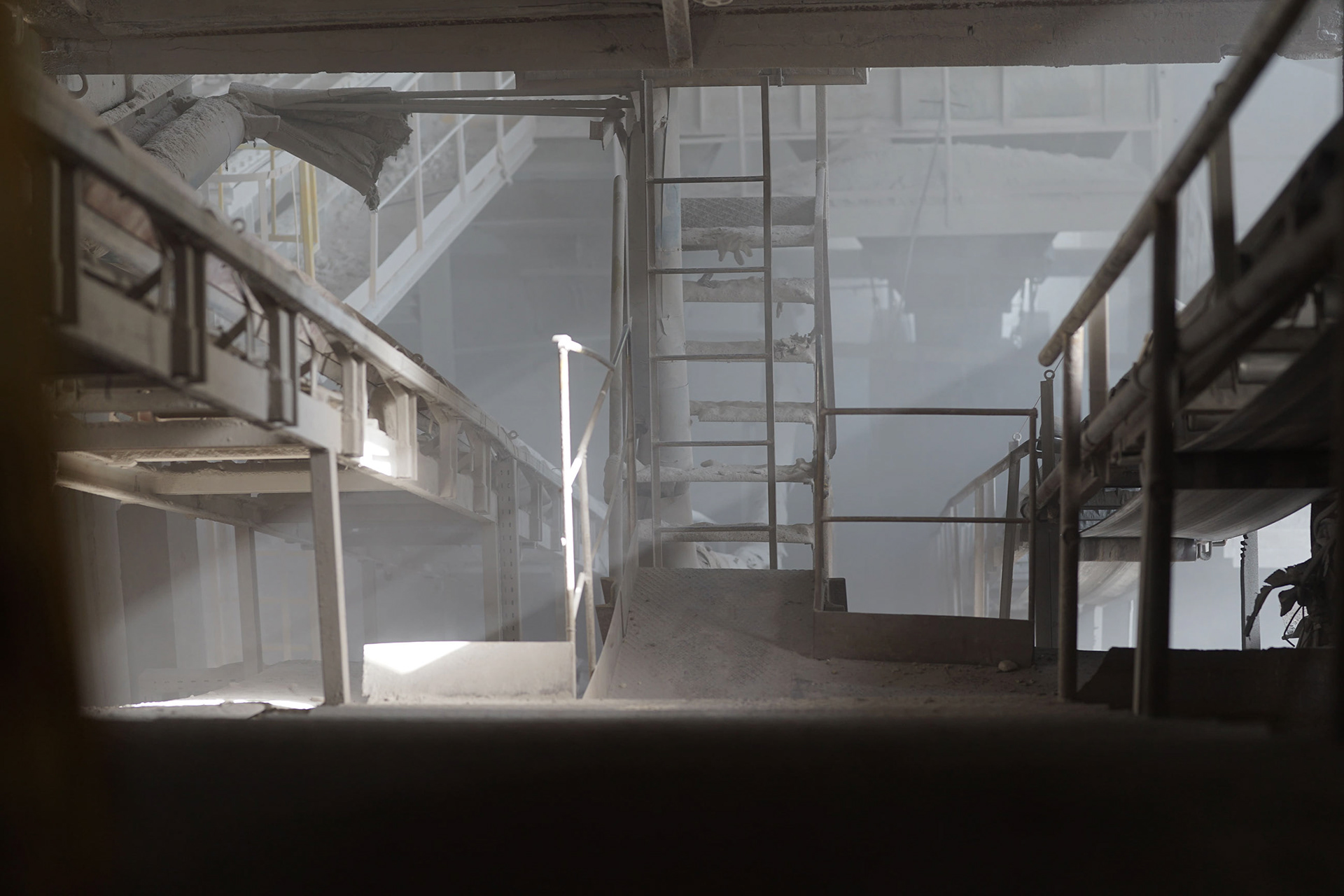
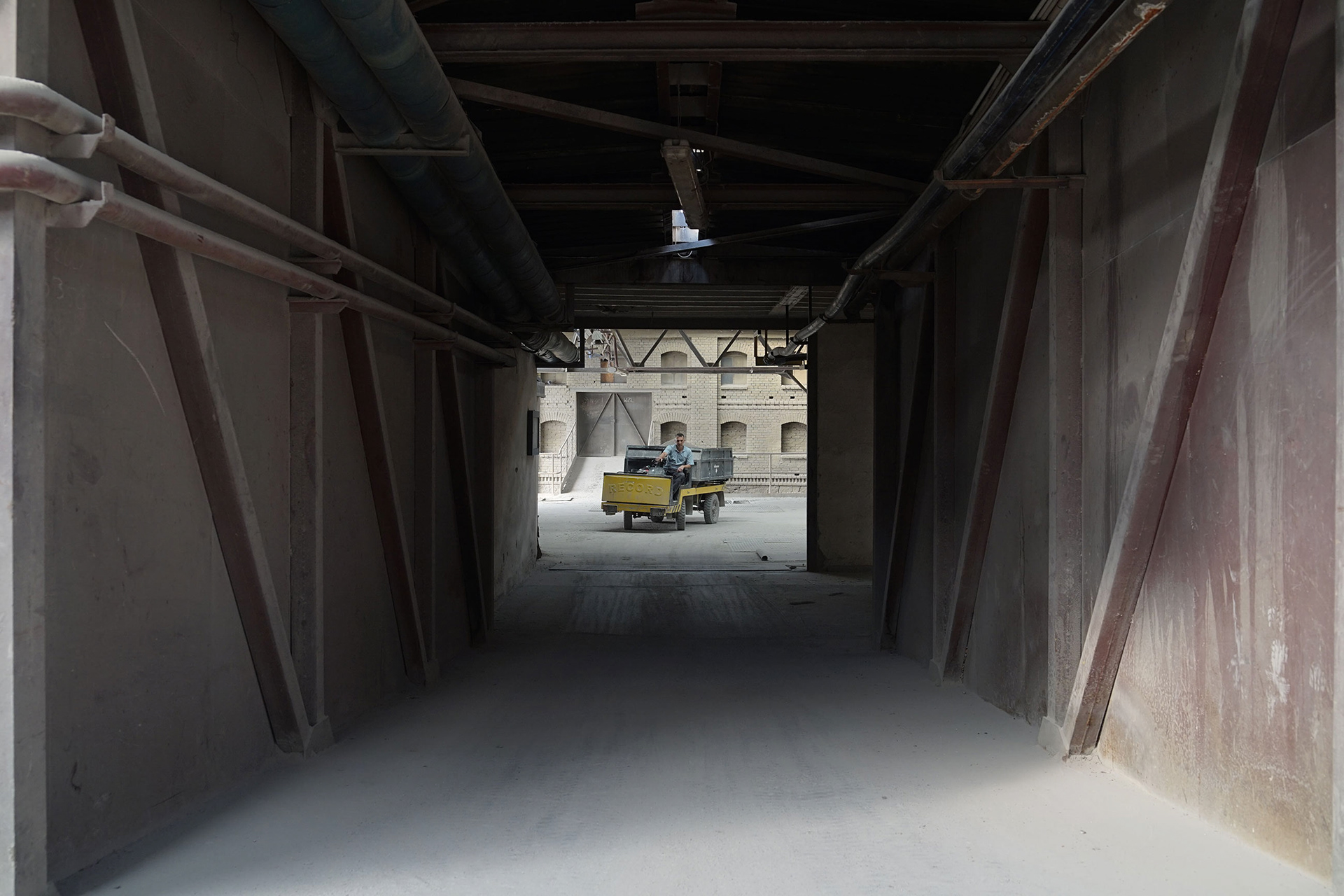
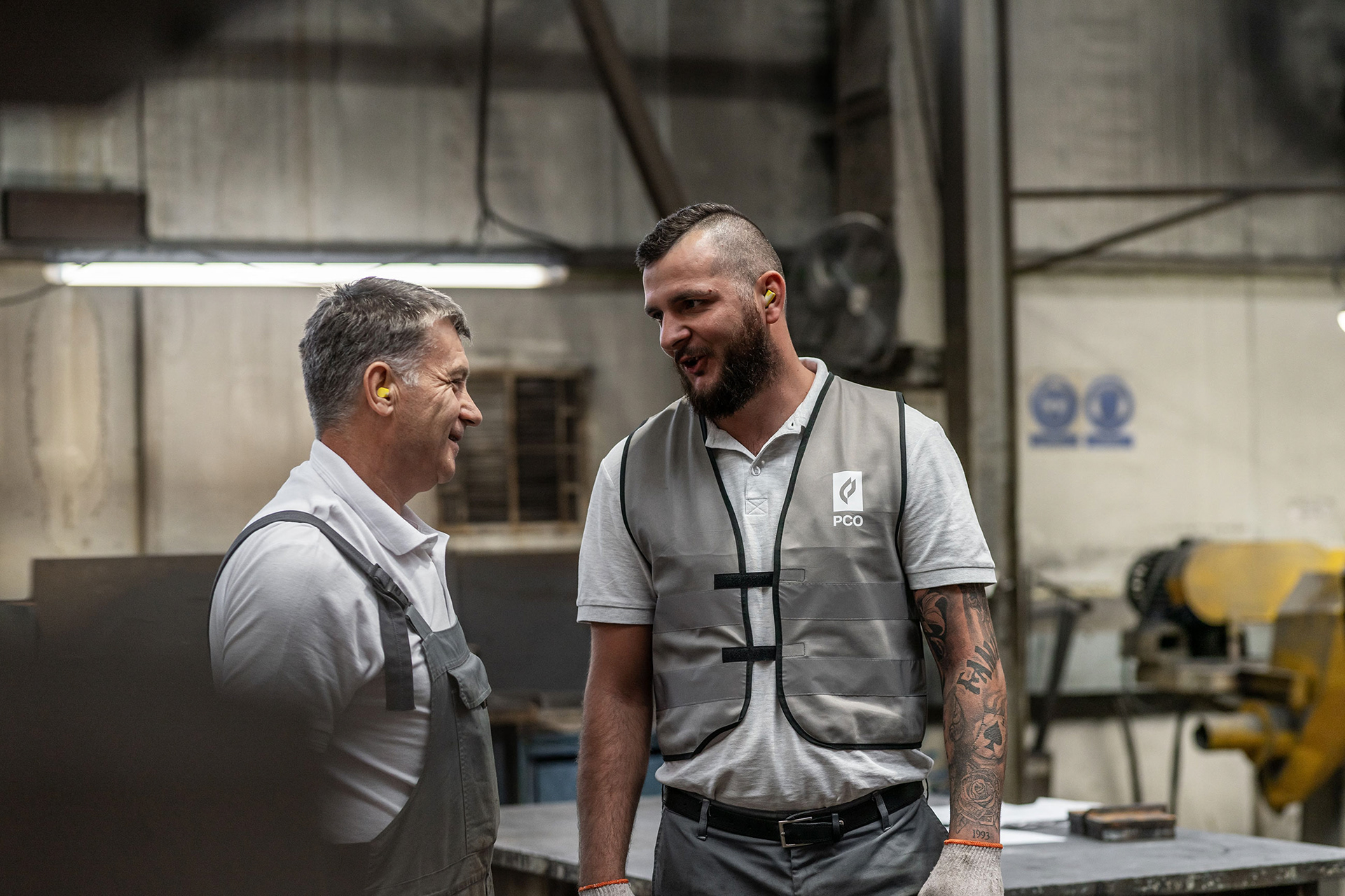
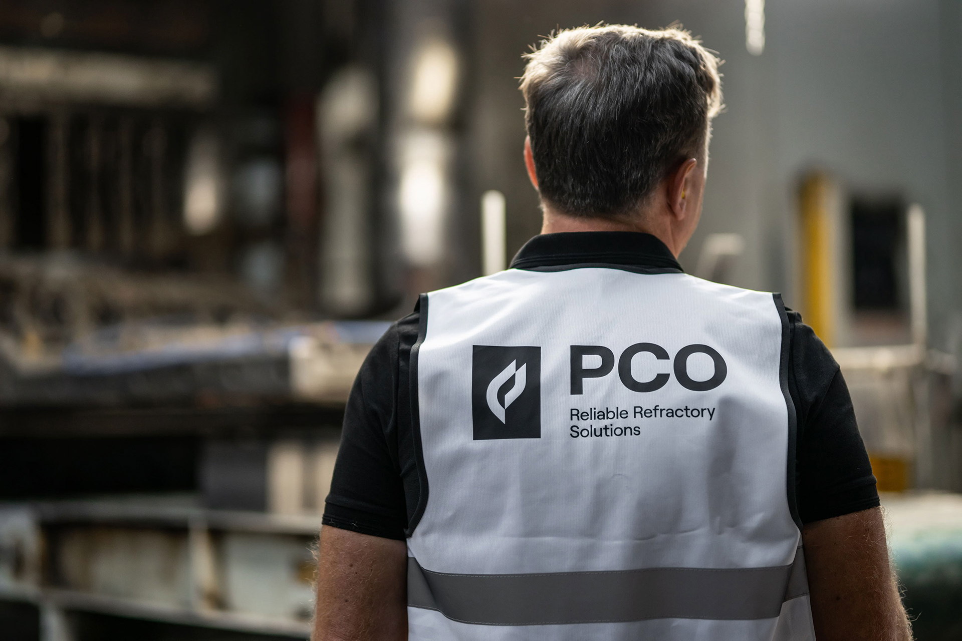
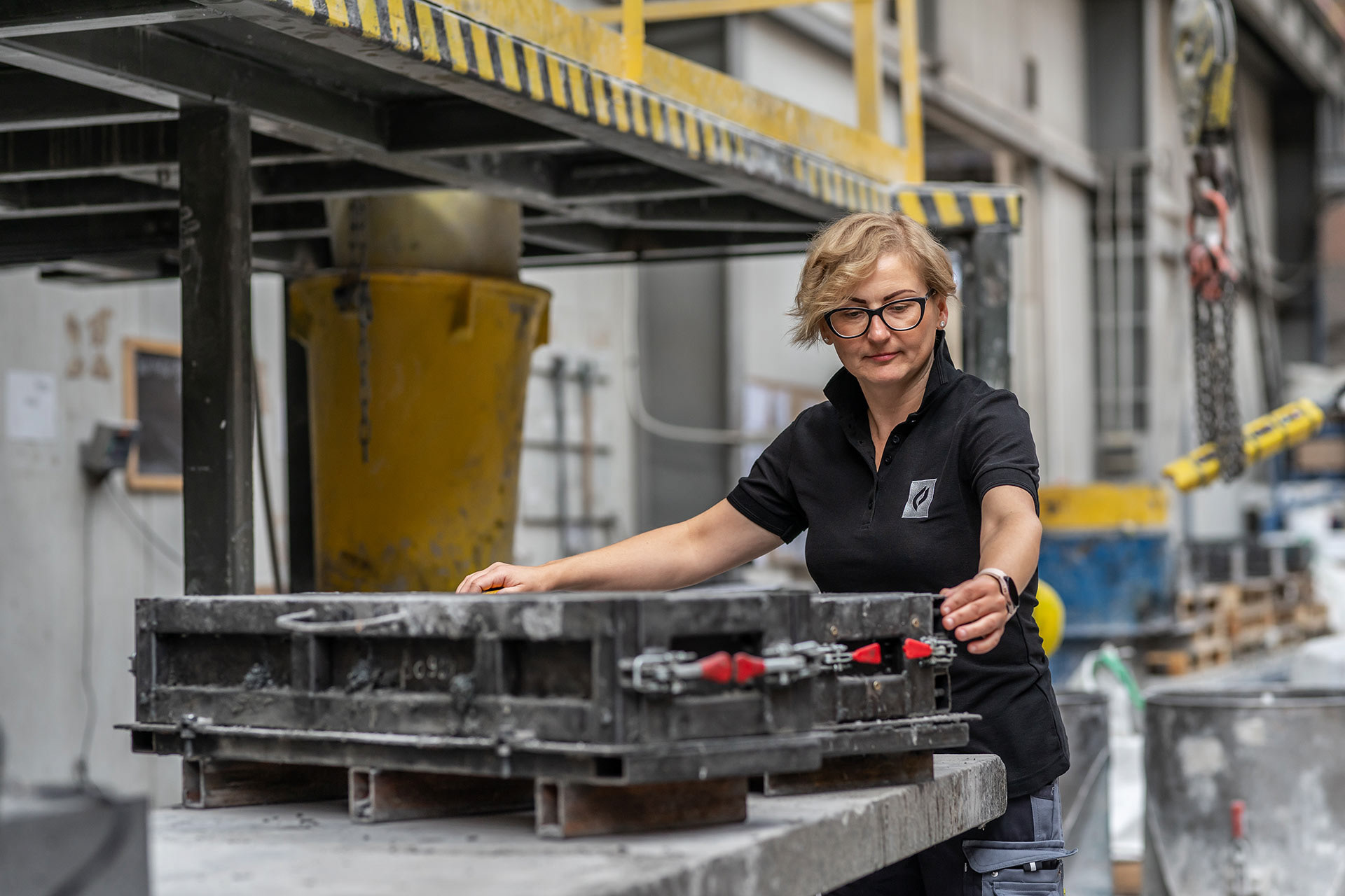
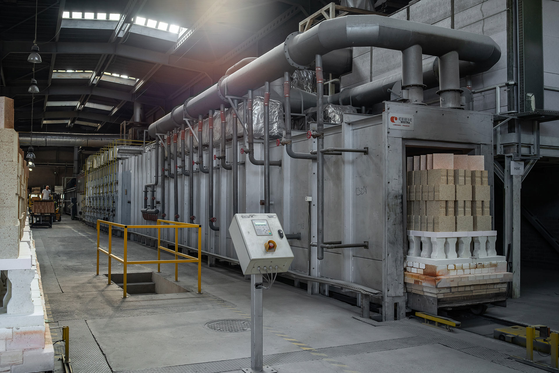
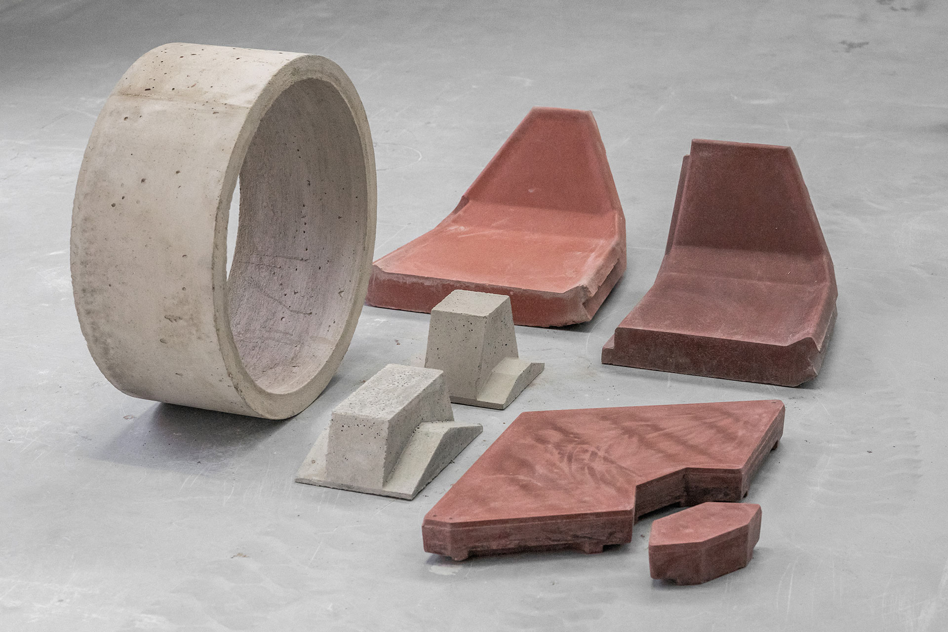
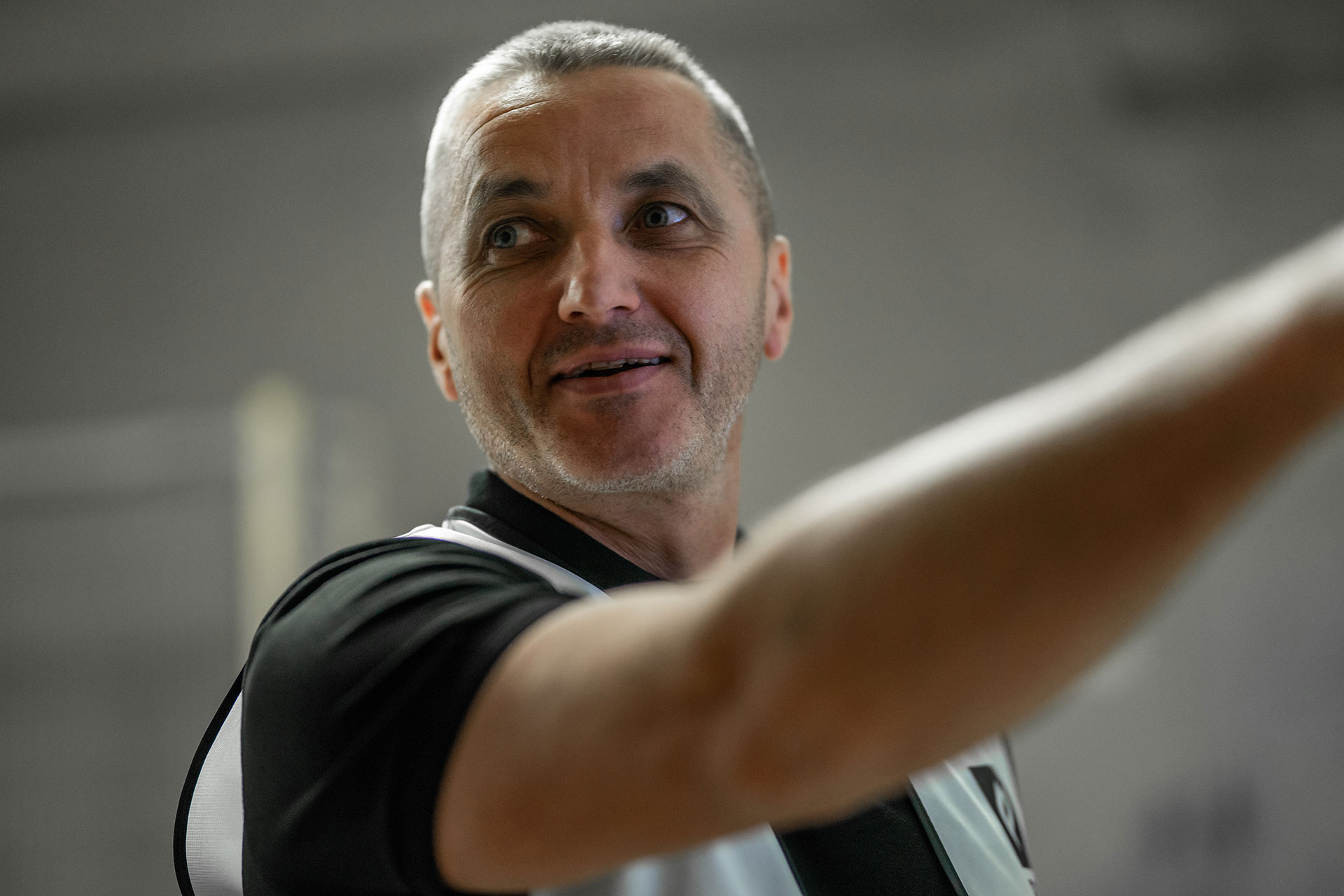
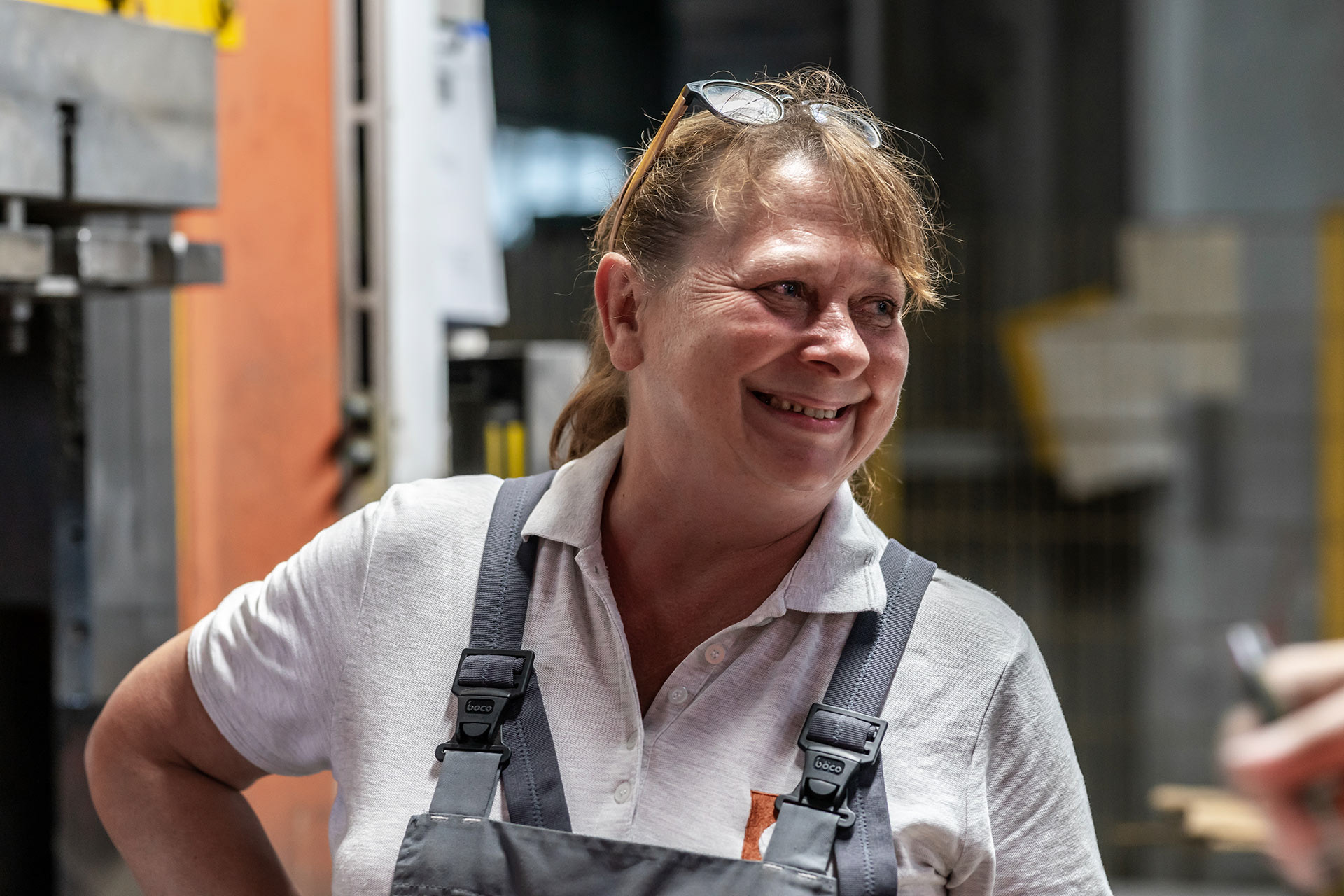
"The client needed to visualize the manufacturing processes, facilities, and teams in various marketing and technical materials. We worked closely with them to prepare a detailed script for the photoshoot and delivered a comprehensive photo bank, including lifestyle and technical photos, as well as product packshots."
Kamil Blicharski | Q1
Photographer, Designer
Photographer, Designer












Are you interested in manufacturing your new brand? Send us an email, and we will happily discuss your needs!
ⓘ Get in touch
Provide your details and we will be in touch within 30 minutes.
